UX/UI design
Oct 18, 2023
Assingment
This is a concept of an online wine store website and was completed as a class assignment.
Teacher gave us some topics to do a simple app concept about. I chose a wine buying app, because I had not designed UI for an online store before, and I wanted to challenge myself to do a design that I was not the target market of.
Design process
My design process began by browsing free stock photo websites to find wine-themed images and immerse my mind in the world of wines.
After getting into the right mindset, I continued by looking at competitors. The most notable ones were Vivino, Wine-searcher, and CellarTracker.
Vivino has the most modern user interface and is very user-friendly, especially for beginners.
Wine-searcher is also convenient, but it is more user-friendly on the web than in the form of an application.
CellarTracker, with its excellent dataset, has an outdated user interface that resembles searching through archives rather than being a convenient and user-friendly tool for finding a preferred wine.
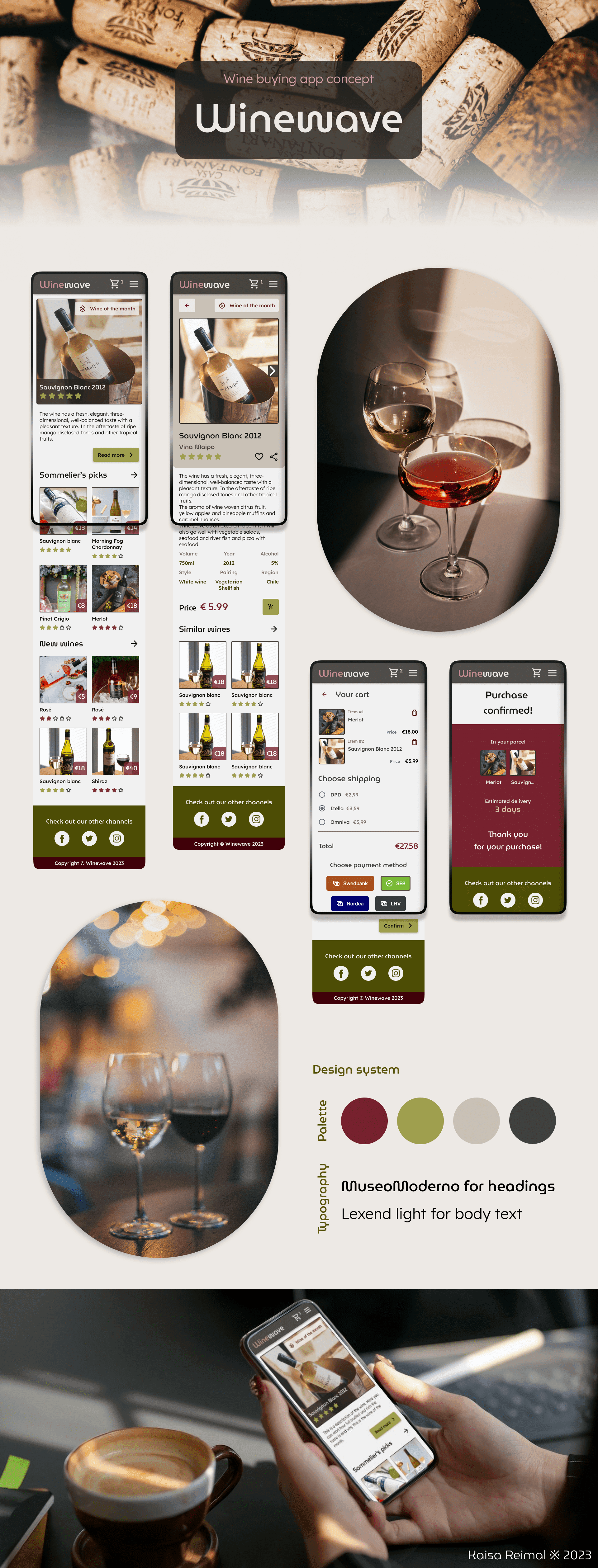
For the user, it is important that the online store be inviting, comfortable, and easy to navigate. Since there was limited time for the project, I initially experimented with low-fidelity wireframes featuring a couple of different navigation styles. However, in the end, a fairly classic menu in the upper right corner and primary content navigation using the 'back' arrow prevailed. Such patterns are familiar to users, thus creating a clear navigation path in the online store.
I chose white and brown as the main colors to convey the warmth and coziness associated with wine. For accents, I used wine red and wine green. When using accent colors, I aimed to be subtle yet playful, assigning the wine ratings in red for red and rosé wines and in green for white wines. This adds a bit of character and uniqueness to the UI.
I decided to create the user interface in softer tones with rounded edges to be inviting and easy on the eyes. In the product detail view, I experimented with displaying product features by arranging them in two rows and three columns. I found that this solution works quite well, as the short labels fit comfortably next to each other while maintaining readability.
For the shopping cart, I mostly followed the design of existing online stores and didn't experiment much, as it was my first time designing a shopping cart. Similarly, on the order confirmation page, I kept the content relatively simple.
My takeaway
During this project, I learned how to quickly put myself in the shoes of someone with whom I have little in common (as I've never been a big wine drinker). I also learned how to work with a color palette in a way that it doesn't become overwhelming but adds a bit of playfulness to the user interface.