UX/UI design
Feb 20, 2024
Assignment
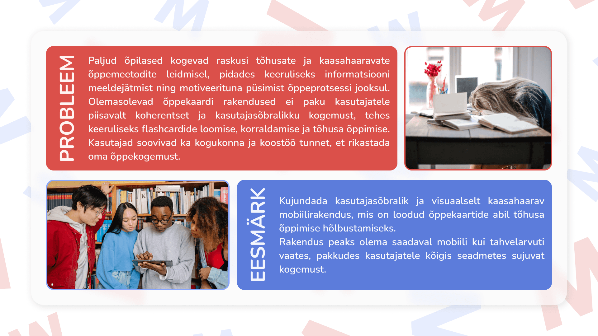
I conducted a case study by identifying pain points through conversations with friends. I discovered that quite a few of my acquaintances have a habit of writing down and trying to memorize difficult words in other languages but fail to find a comfortable and reliable app to do so. Taking that into account, I designed user flows for a flashcard app targeting students and young adults.
Case study in Estonian is down below!
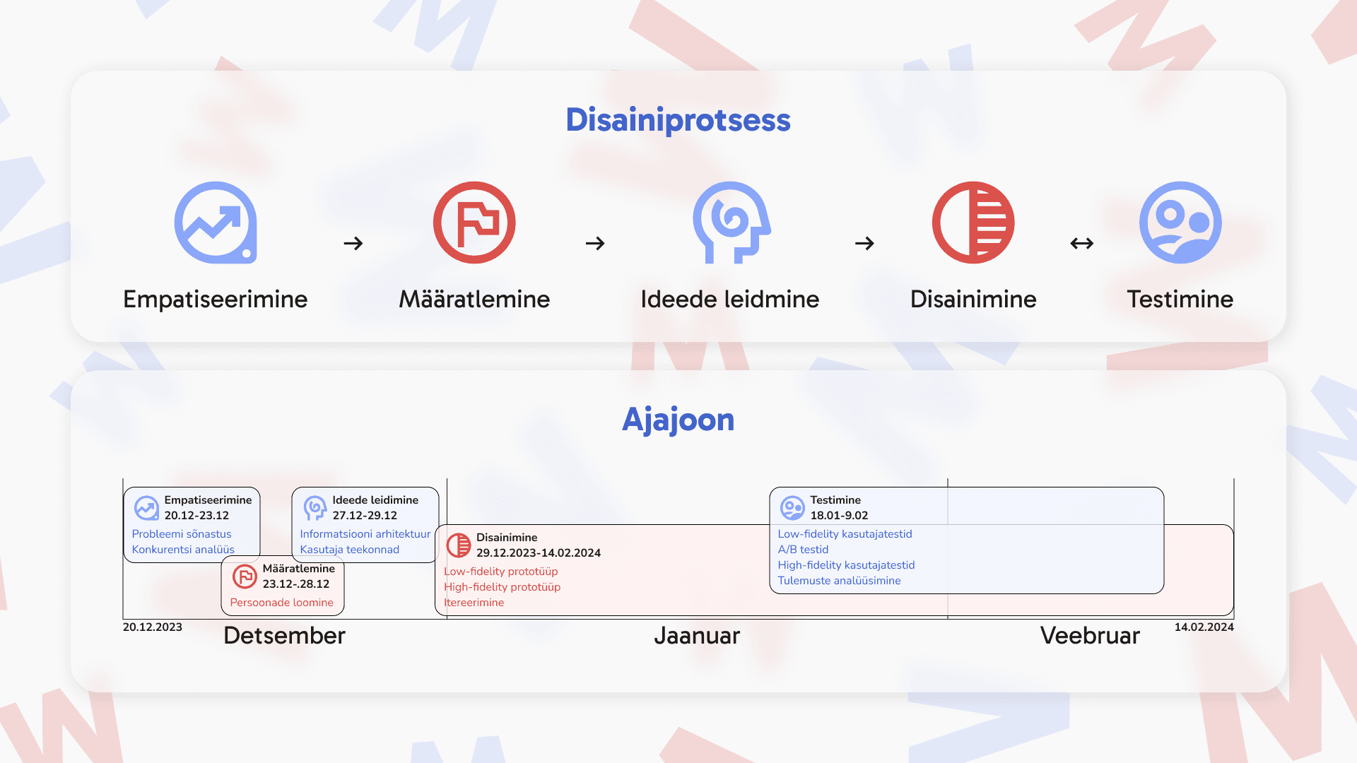
Design Process
Empathize, Define, Ideate
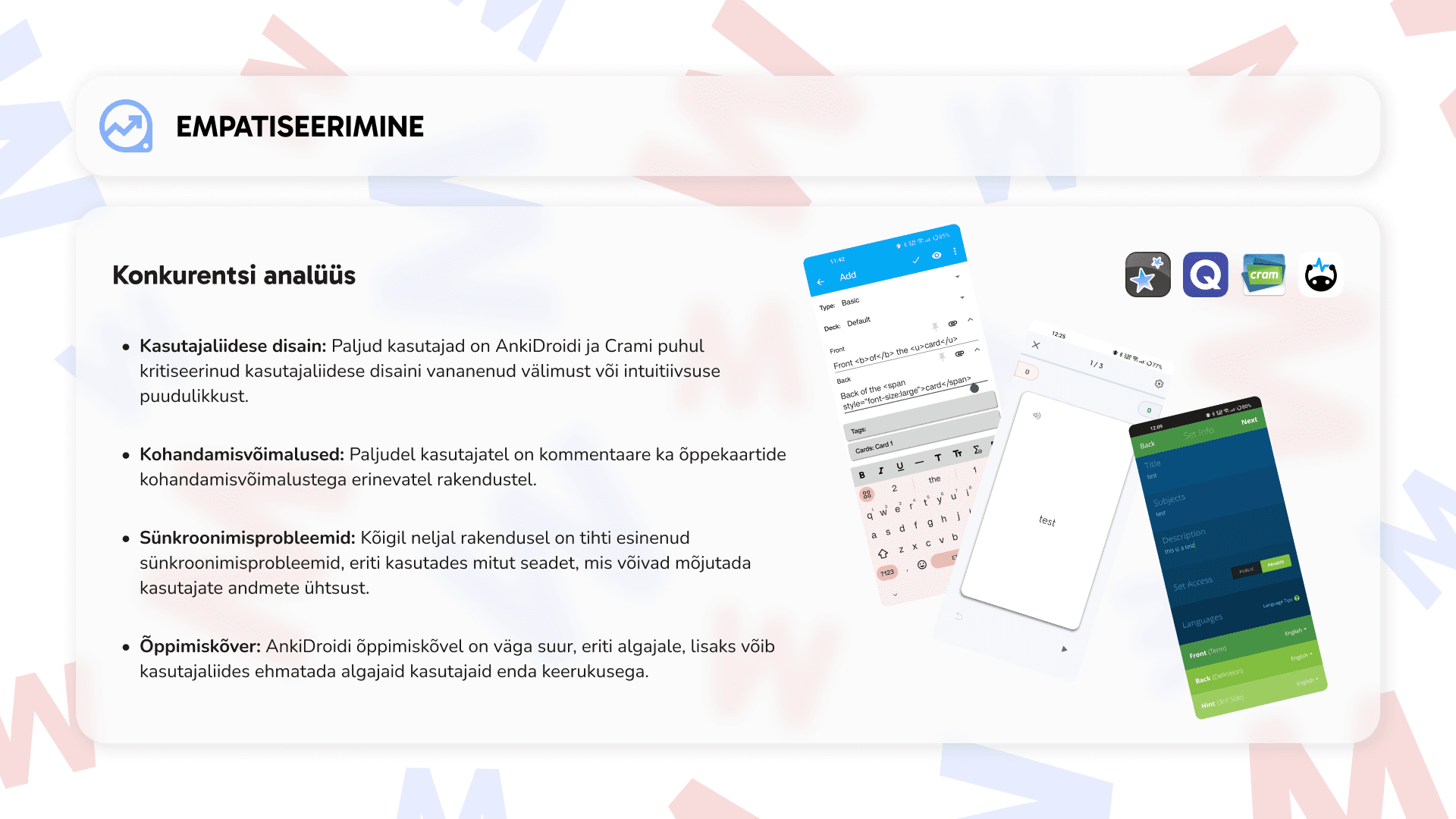
I began my process with a competitive study. This helped me understand common pain points from the user's perspective and map out the user flow of the most widely used apps in this domain.
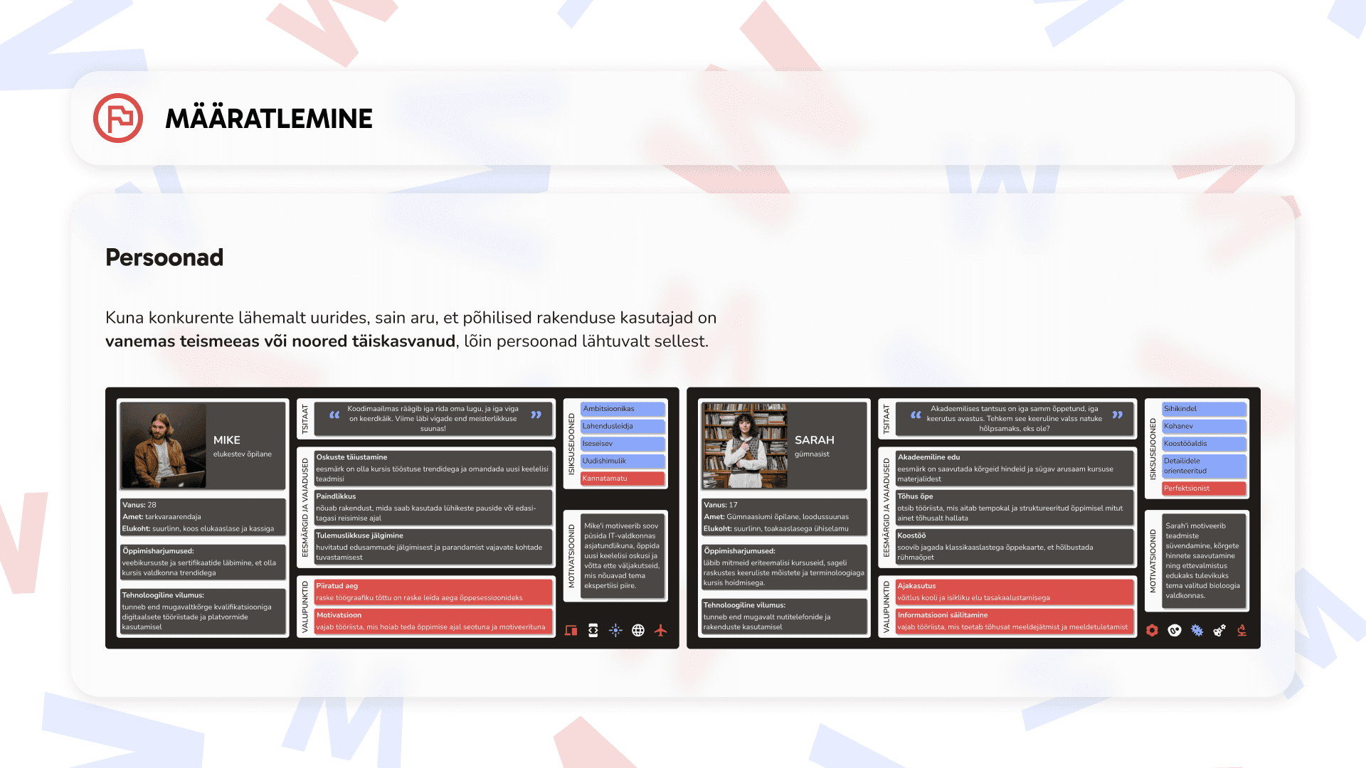
Next, I focused on the target users for this app. Developing two personas — a motivated adult seeking continuous learning and a student requiring collaboration and school-related learning — guided my user-centric approach.
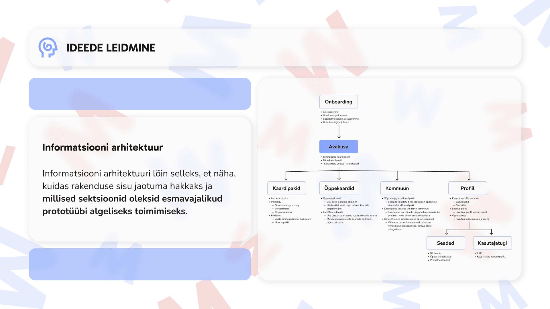
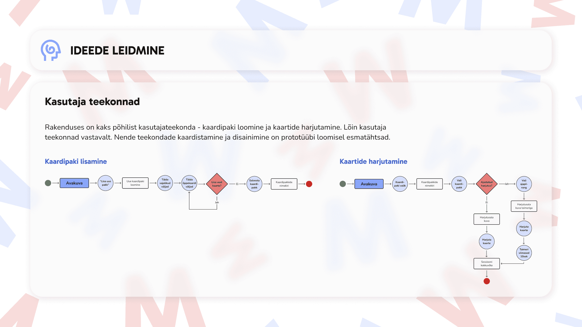
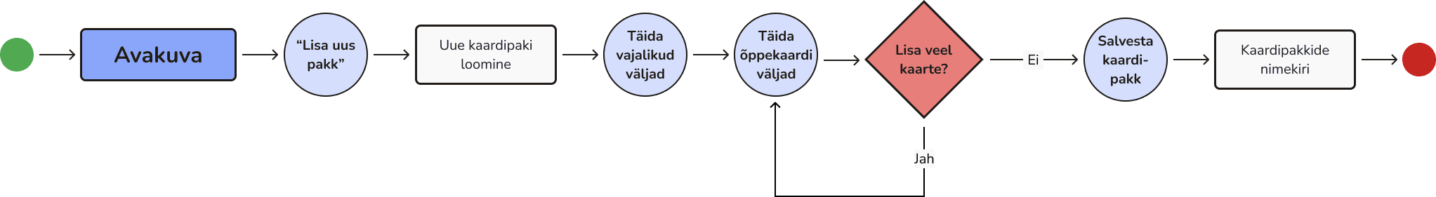
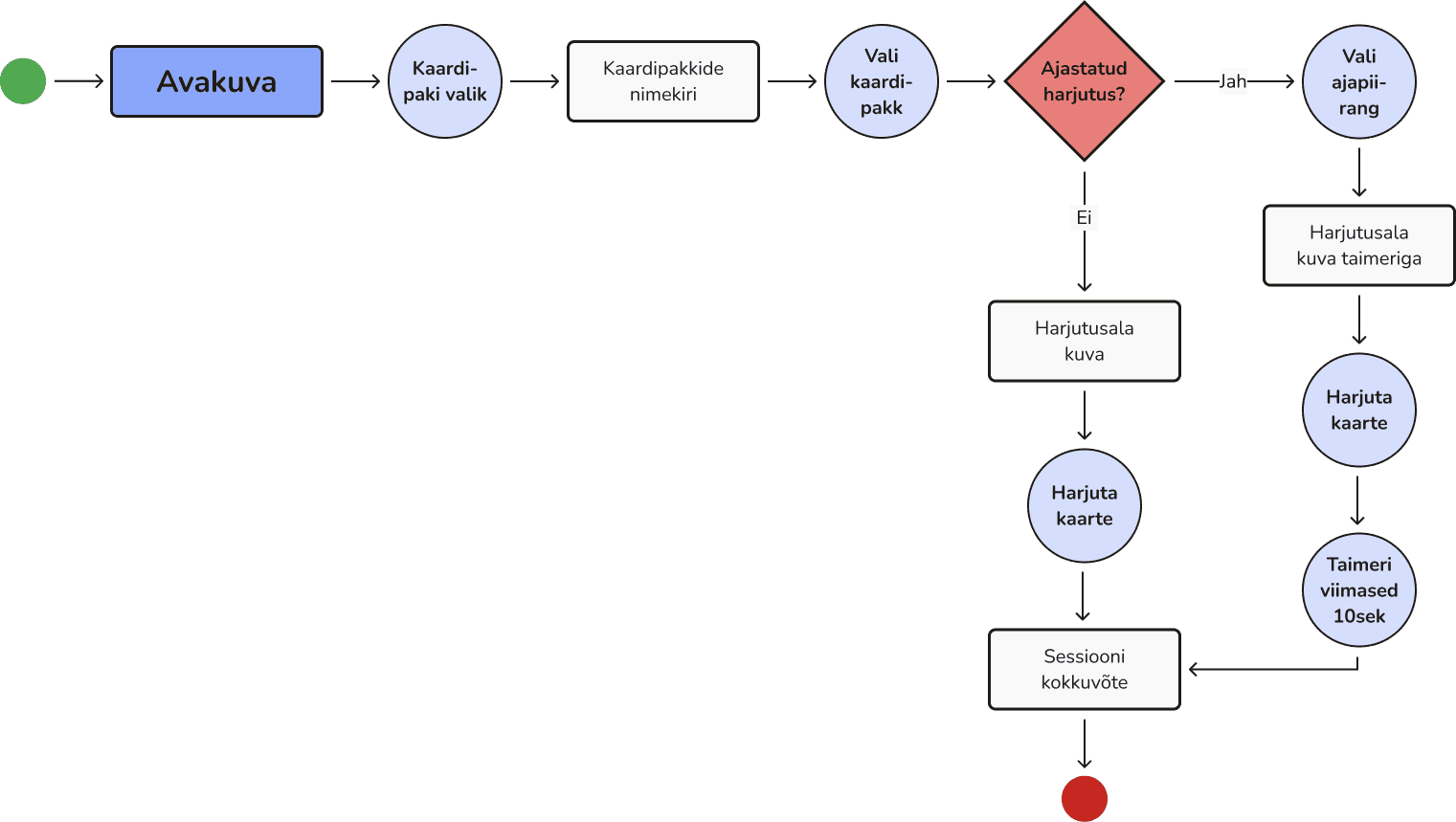
With my user personas in mind, I mapped out their distinct needs and formulated the information architecture, from which I derived the primary user flows to visualize.
Flow for adding a card pack
Flow for practicing flashcards
Design and Testing
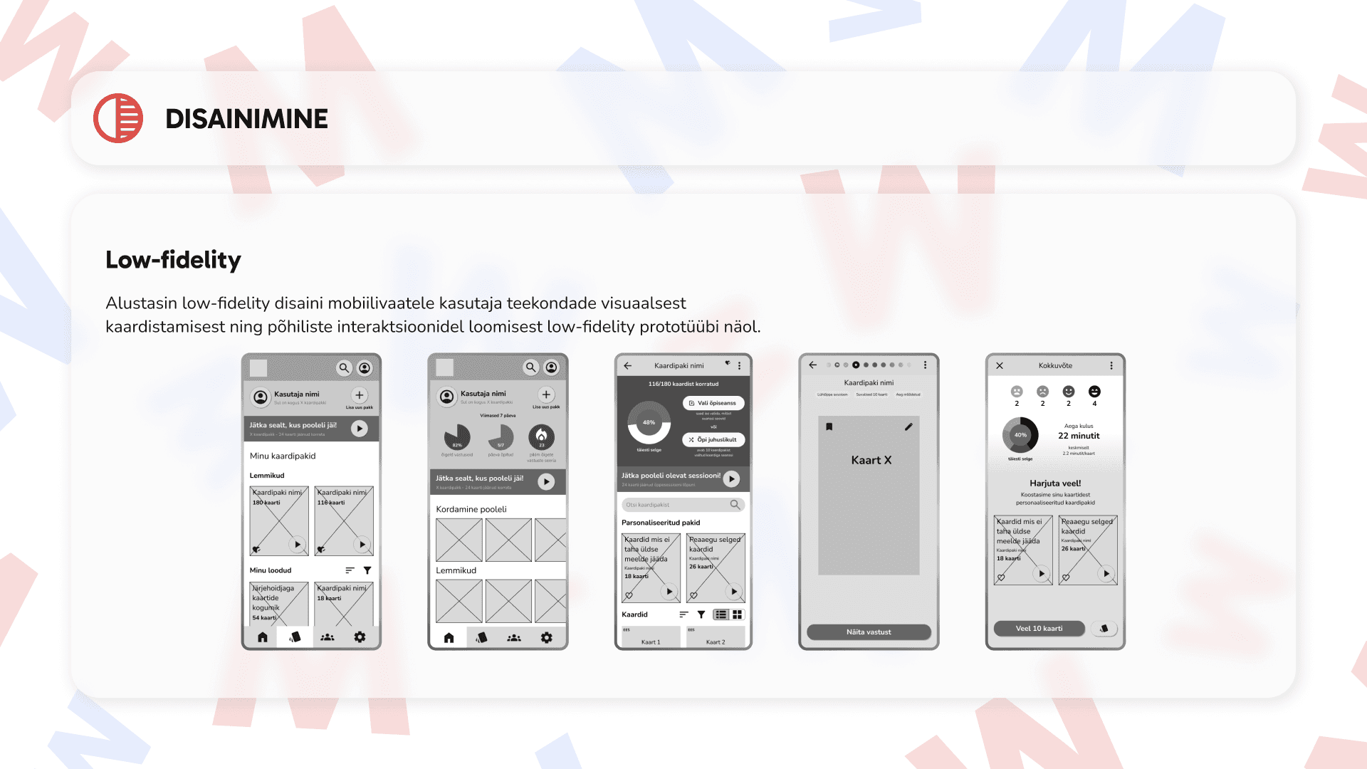
I began designing the main user flows for a low-fidelity prototype. In this phase, I revisited my competitors many times to see how they have solved various design problems and also to see the places that the users have mentioned to be uncomfortable.
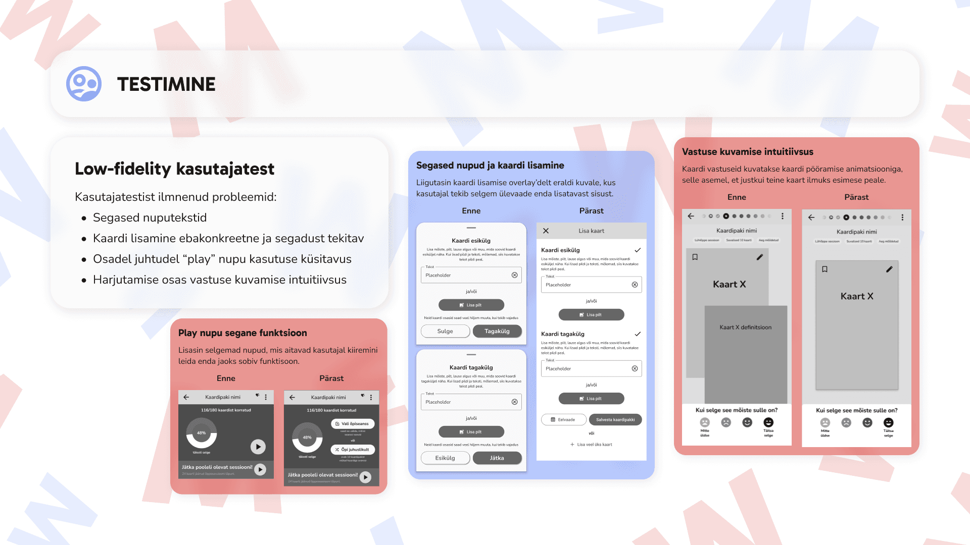
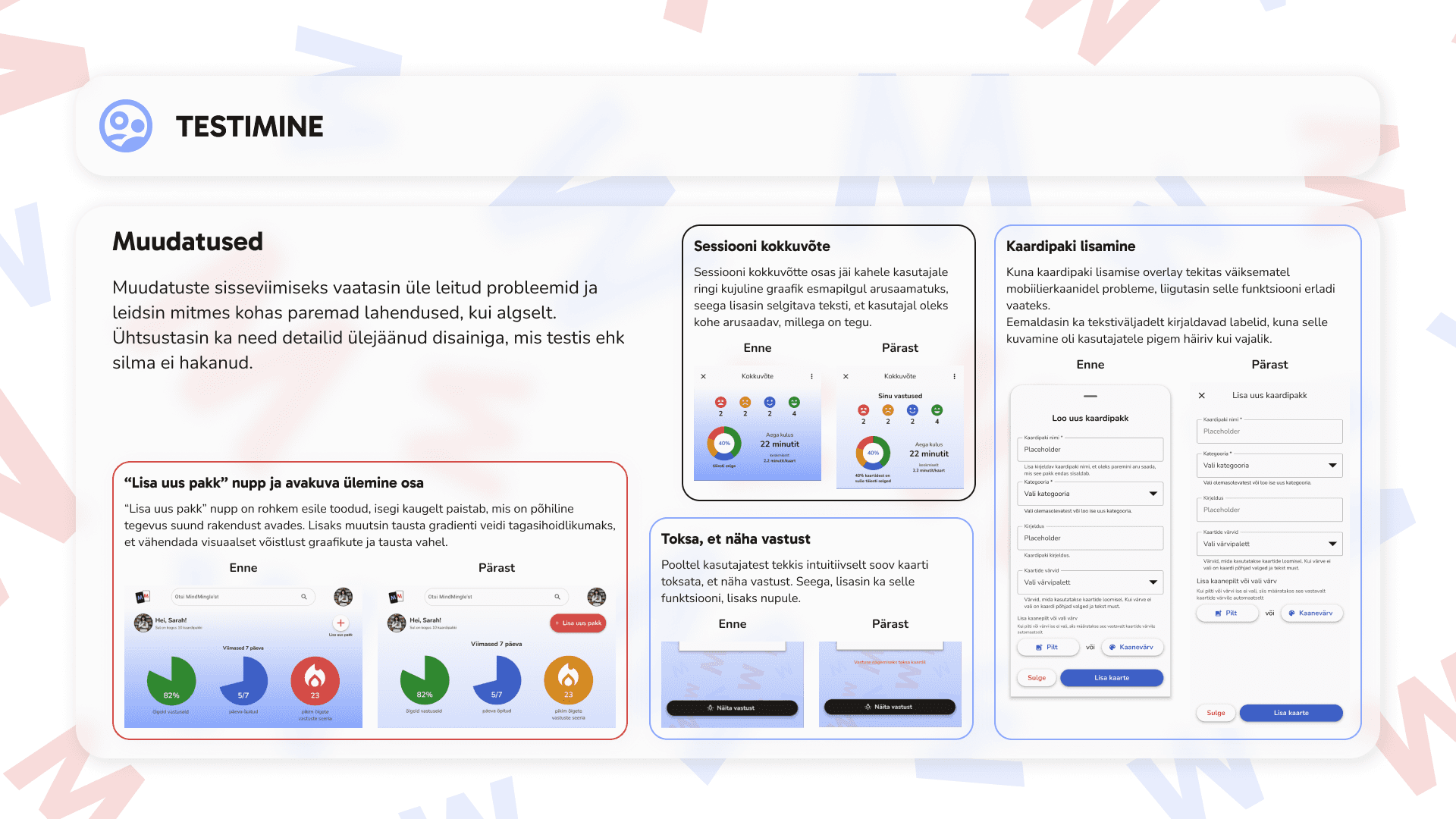
After finishing the low fidelity, I tested the prototype with two users and got great feedback about some issues that needed my immediate attention like unclear or missing button texts, the flow for adding a card to the pack being confusing, and displaying of answers in the practice section being unintuitive. So, I iterated.
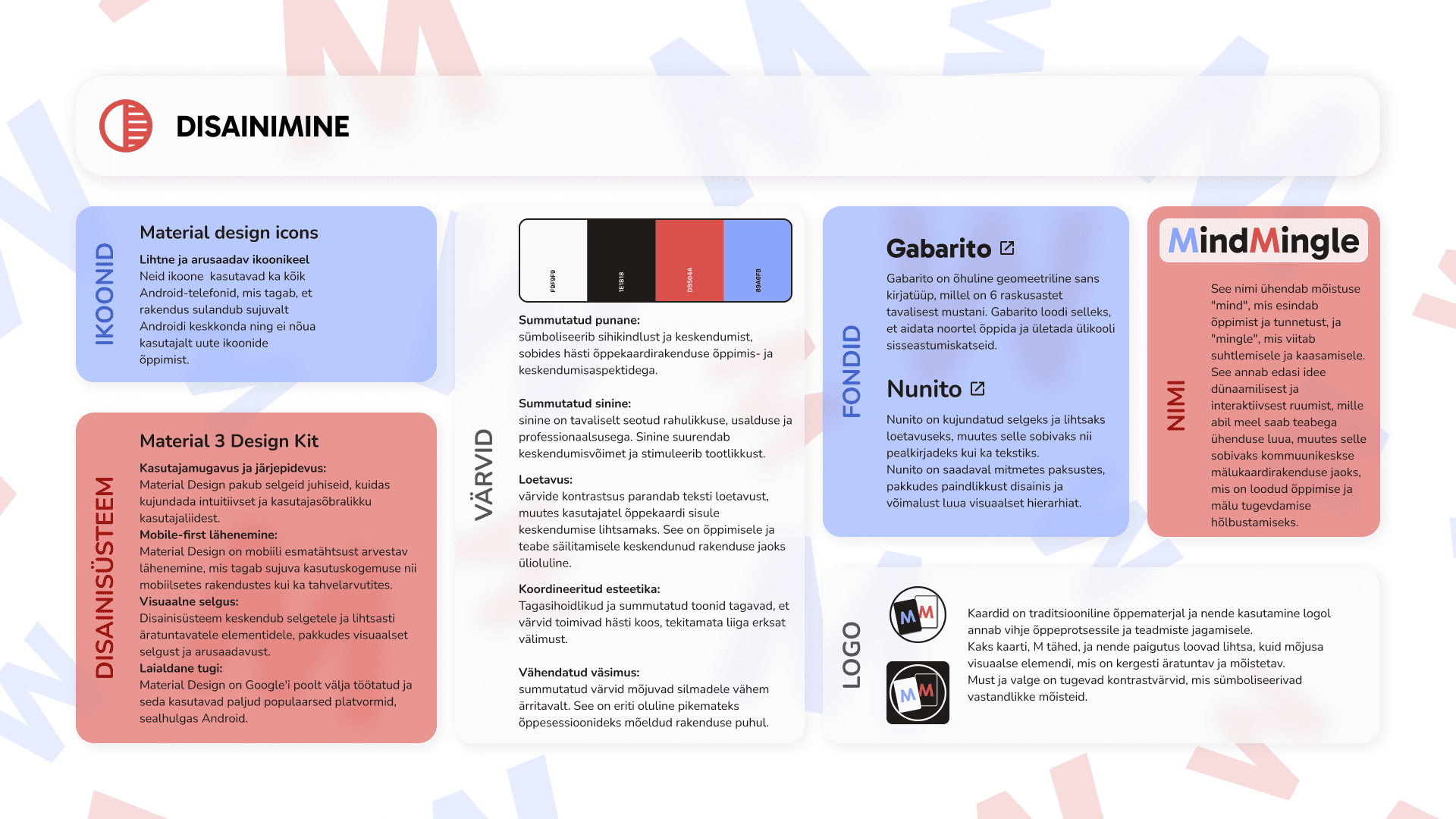
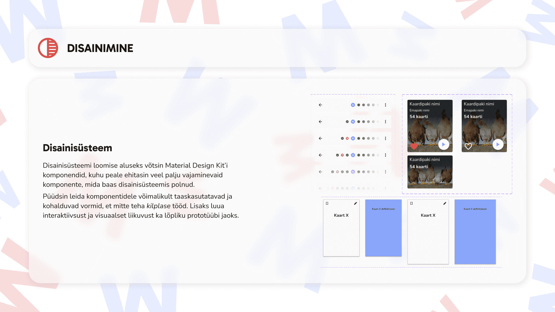
From there, I moved along to high-fidelity and began by choosing a design system to base my design off of and creating a style guide. Since I needed a system that was comfortable, understandable, and familiar to many users, I chose Material Design.
I thought about different color palettes as well, but ultimately landed on muted red to convey passion, excitement, and determination to learn, and blue to convey trustworthiness and professionalism. They are very strong and still playful because I knew, thinking back to my personas, that I needed to design an app that was playful yet serious, light yet academic.
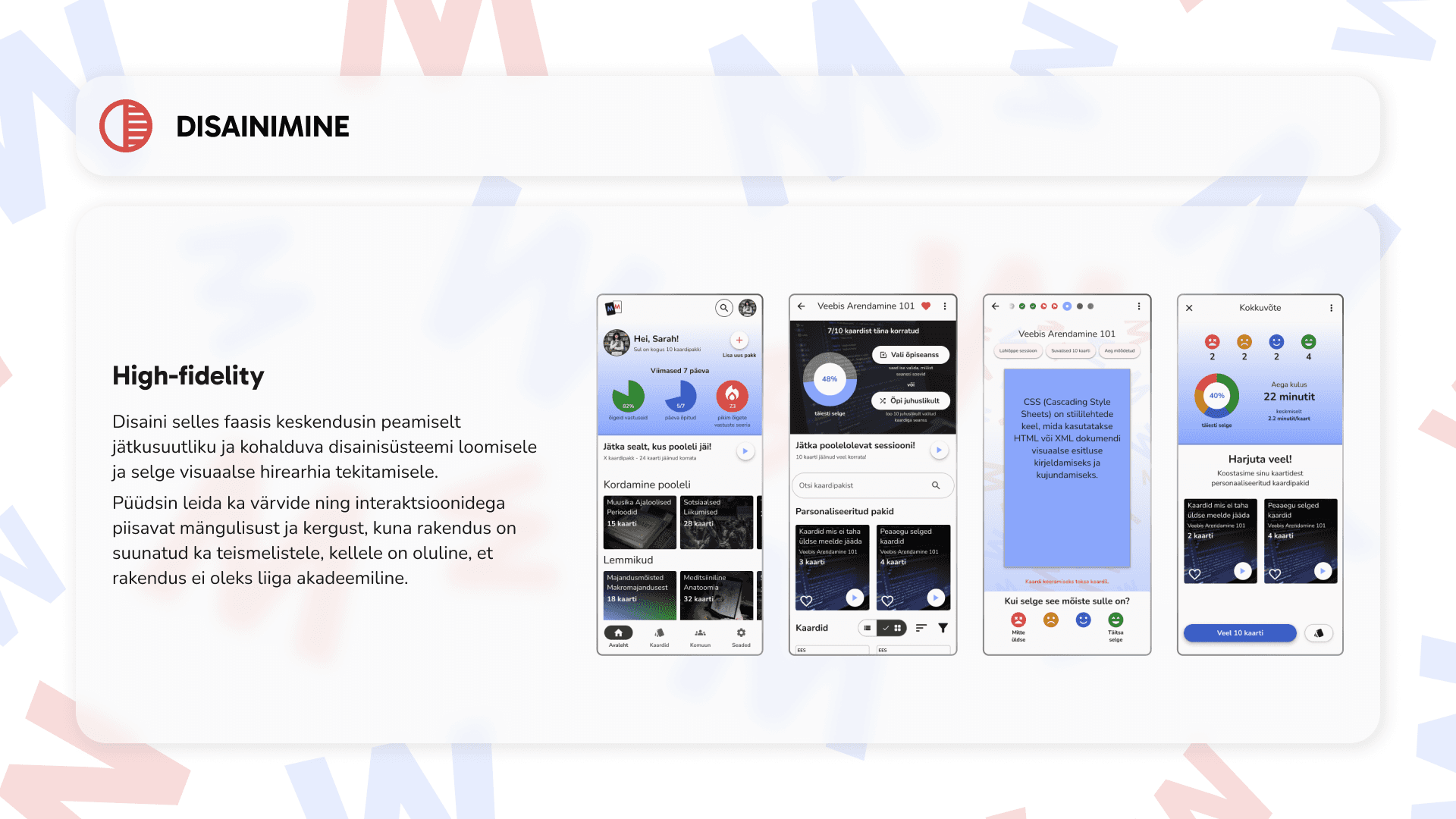
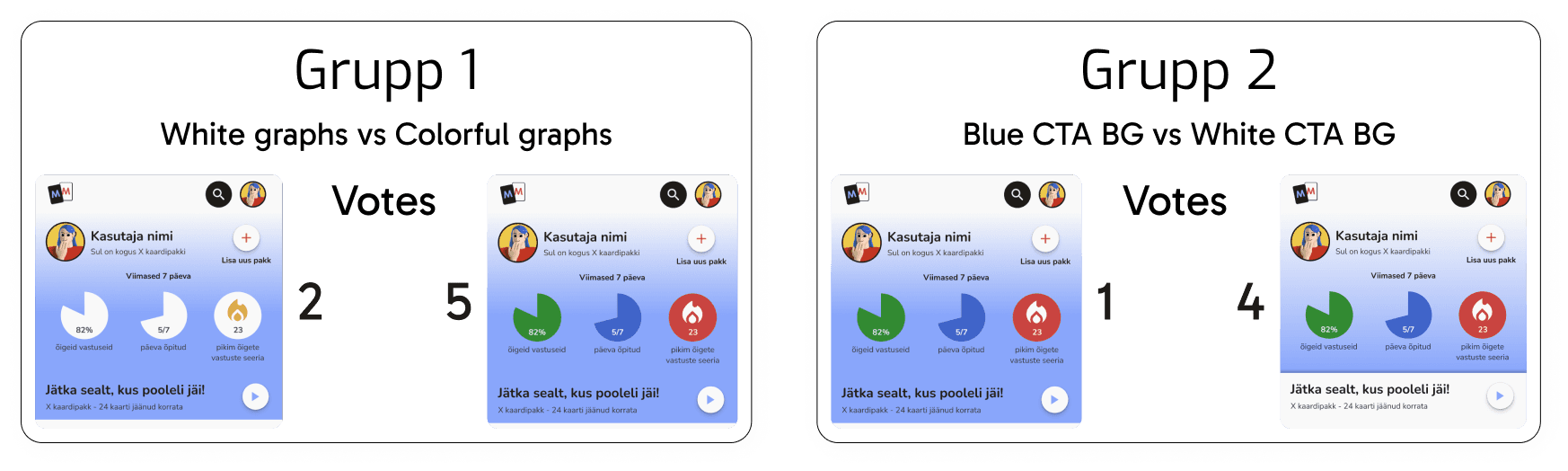
After that, I began to convert my design into a high-fidelity prototype. I started by building the main parts of the design system, focusing on component reusability and responsiveness. The design of the prototype needed to be playful enough to grab and maintain the attention of older teens but still sleek and simple enough to not feel like a kids app to young adults. I experimented a lot with colors and conducted two A/B tests with different user groups to see which direction I needed to take with my design.
A/B test results
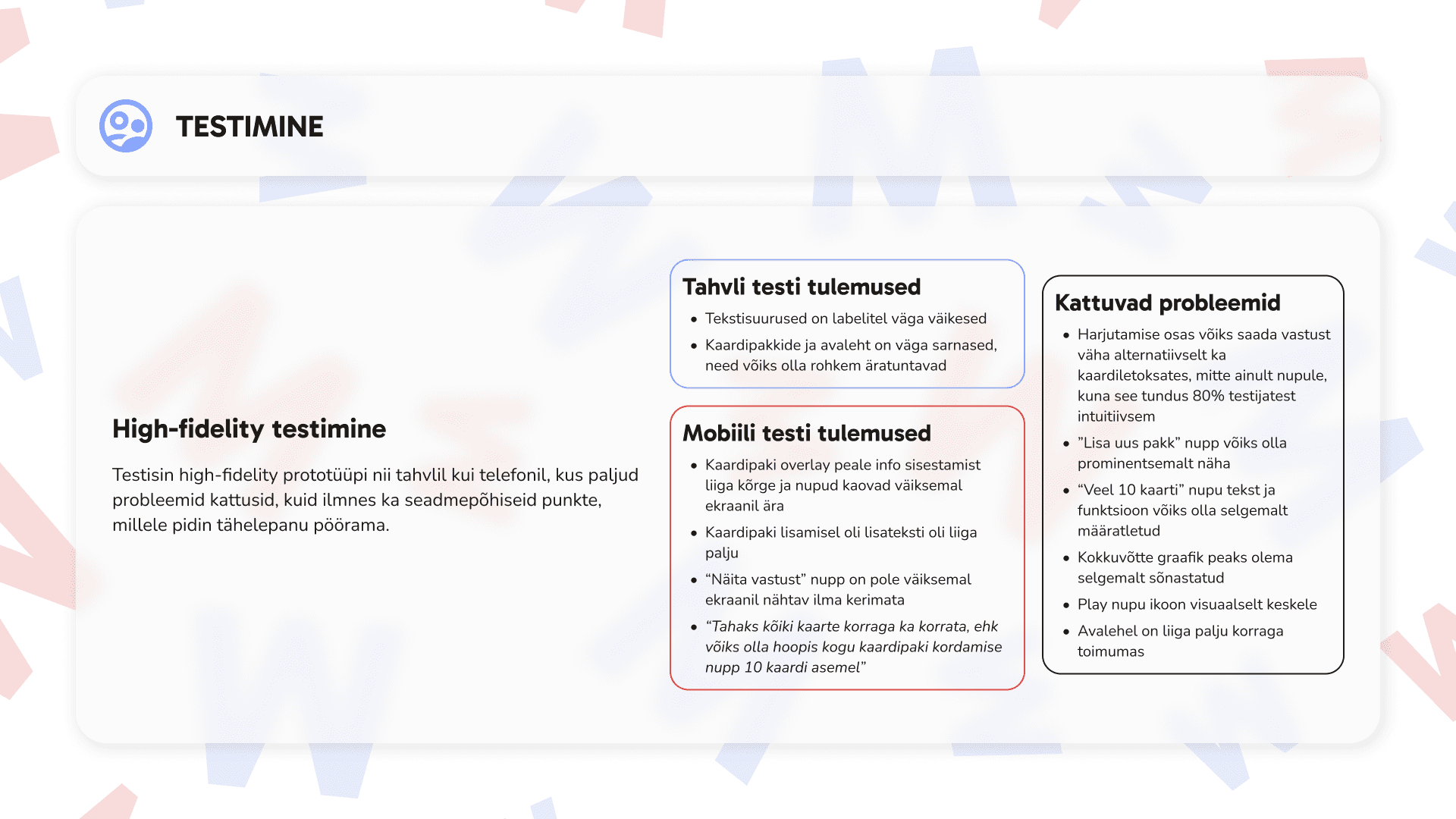
Once I finished the prototype, I began testing. Since I designed for tablet as well as mobile, I needed to test on both devices to find out any device-specific problems. From testing, I discovered some overall problems as well as device-specific issues that the users had, especially on smaller phones. The main issues were:
The "Lisa uus pakk" button was not easily noticeable, even though it is a primary action in the application.
During practice, users had to press a button to see the answer, but most users intuitively wanted to tap directly on the card.
The summary section of the practice was a bit confusing for a few users.
On smaller screens, when adding a card deck, the buttons for proceeding disappeared after text input.
So, I iterated and then showed the changes I made to the users that pointed out the problems in testing to gain feedback and iterate further.
My Takeaway
I deliberately chose a challenging color combination for myself to work with - red and blue. I feel that I found a way to make these colors work in favor of my design and use them in a way that they are not visually too dominant.
In addition, I have not previously created a learning application where the views need to accommodate a lot of information at once without overwhelming the users visually.
I also received confirmation that it is always advisable to design for the smallest available screen first, as two participants in the user test had smaller screens, and some buttons ended up below the fold, which should not have happened.