Mar 12, 2024
UX/UI design
Volugram is a web-based volunteer recognition tool that validates short-term and micro-volunteering as a form of informal learning. The platform connects volunteering, learning, and community initiatives, offering volunteers a personalized recognition journey and coordinators practical tools to assess volunteer contributions.
Volugram project was honored with the European Innovative Teaching Award 2025.
My role
I was responsible for the end-to-end redesign of the Volugram web application and its supporting materials. My work included:
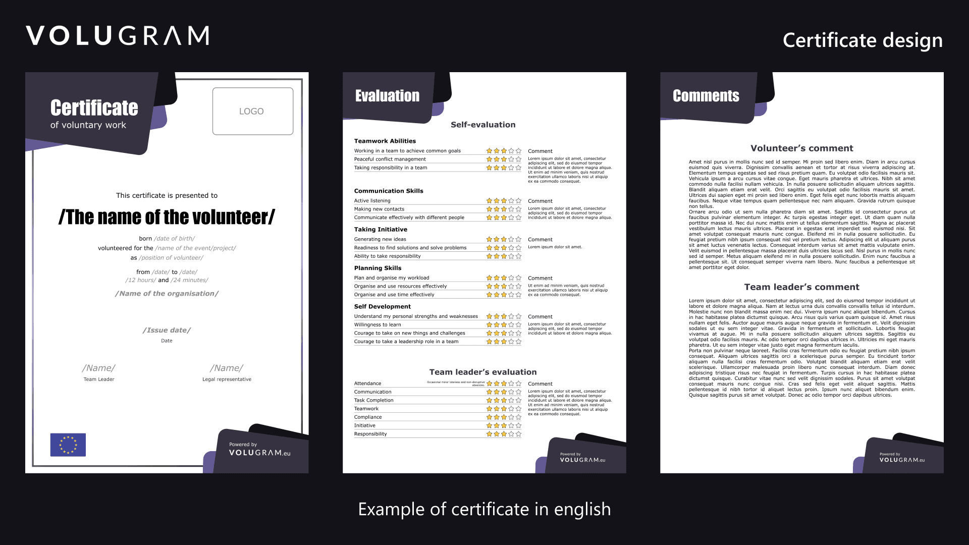
Designing a three-page volunteer certificate in four languages
Conducting a UX/UI review of the existing application
Leading the full redesign of the recognition tool and landing page
Creating a design system and supporting developer handover
Designing and deploying the project website volugram.eu on WordPress
Certificate design
Due to a tight deadline, I prioritized the certificate design early in the project. I explored multiple layout directions and developed a clean, adaptable certificate that aligned with Volugram’s visual identity without overpowering it.
The final result included documented templates in Estonian, English, German, and Norwegian, with both filled examples and blank versions for future use.
UX/UI redesign of the recognition tool
UX/UI review & recommendations
I started by conducting a UX/UI review of the existing Volugram application, focusing on clarity, navigation, and overall usability. The goal was to identify practical, incremental improvements rather than redesigning for redesign’s sake.
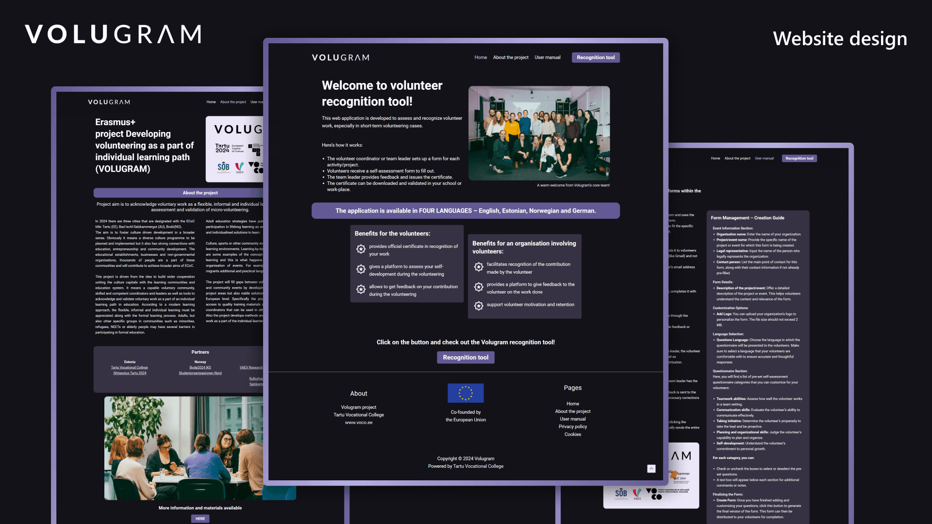
Based on this review, I compiled a structured set of UX/UI recommendations covering user flow, visual consistency, and interaction clarity. One key suggestion was to align the informational landing page visually with the recognition tool’s dark theme, as the previous light-themed landing page created an abrupt and confusing transition for users.
This change helped create a more coherent and trustworthy experience across the platform.
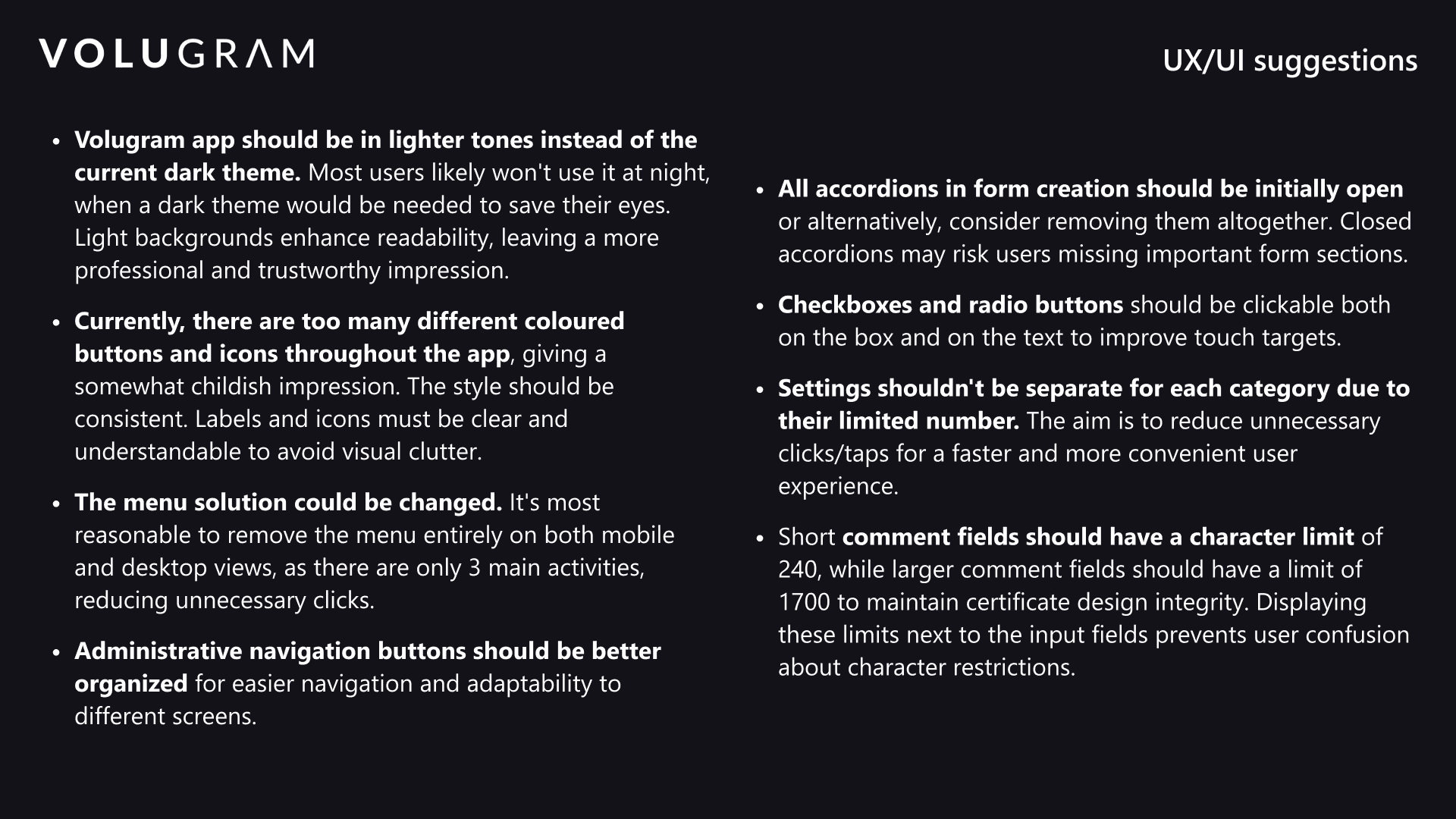
Key improvements included:
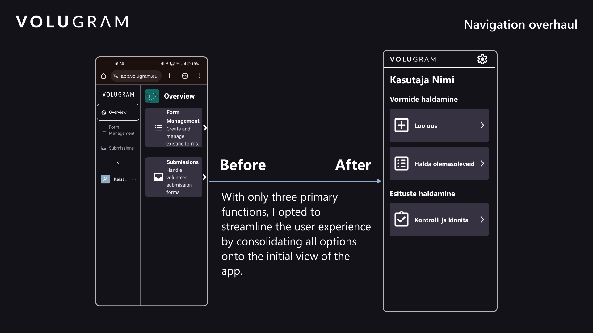
Simplifying navigation by removing unnecessary menu layers
Consolidating the user journey into a single, clear starting view
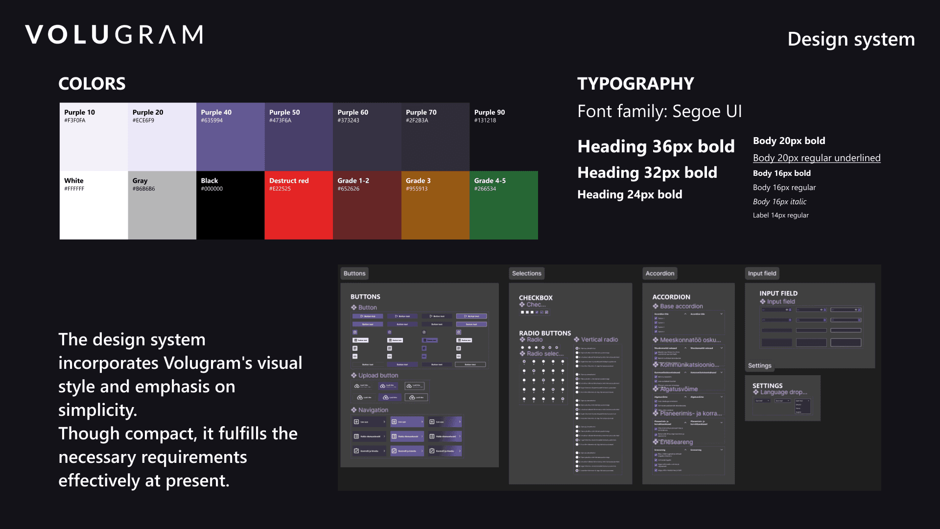
Defining core user flows and building a lightweight design system
Design overhaul of the recognition tool
During the project, Volugram transitioned to a new development partner, which created an opportunity to rethink the recognition tool more holistically. I was asked to take on the full redesign of the application while preserving the existing backend logic and form structure.
I began by mapping the core user flows and defining a streamlined navigation model. Since the tool only had three main functions, I removed the complex menu structure and brought all primary actions into a single, clear starting view. In parallel, I created a concise design system to support consistent implementation by the developer.
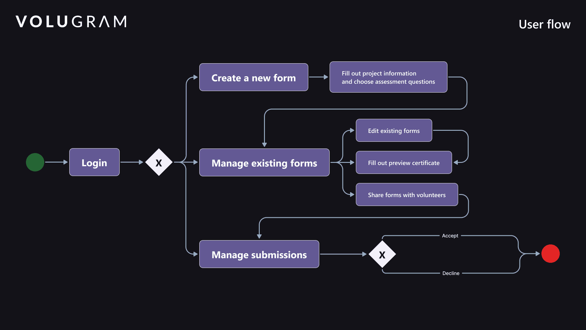
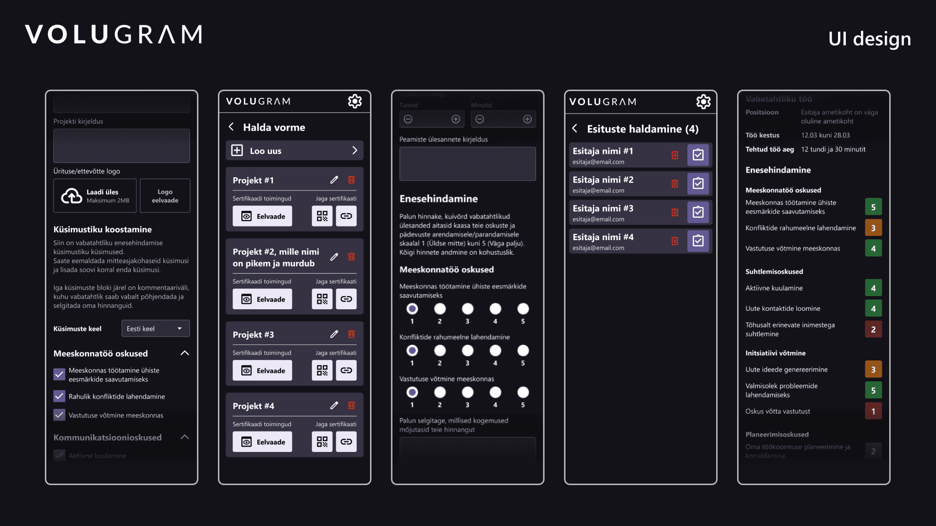
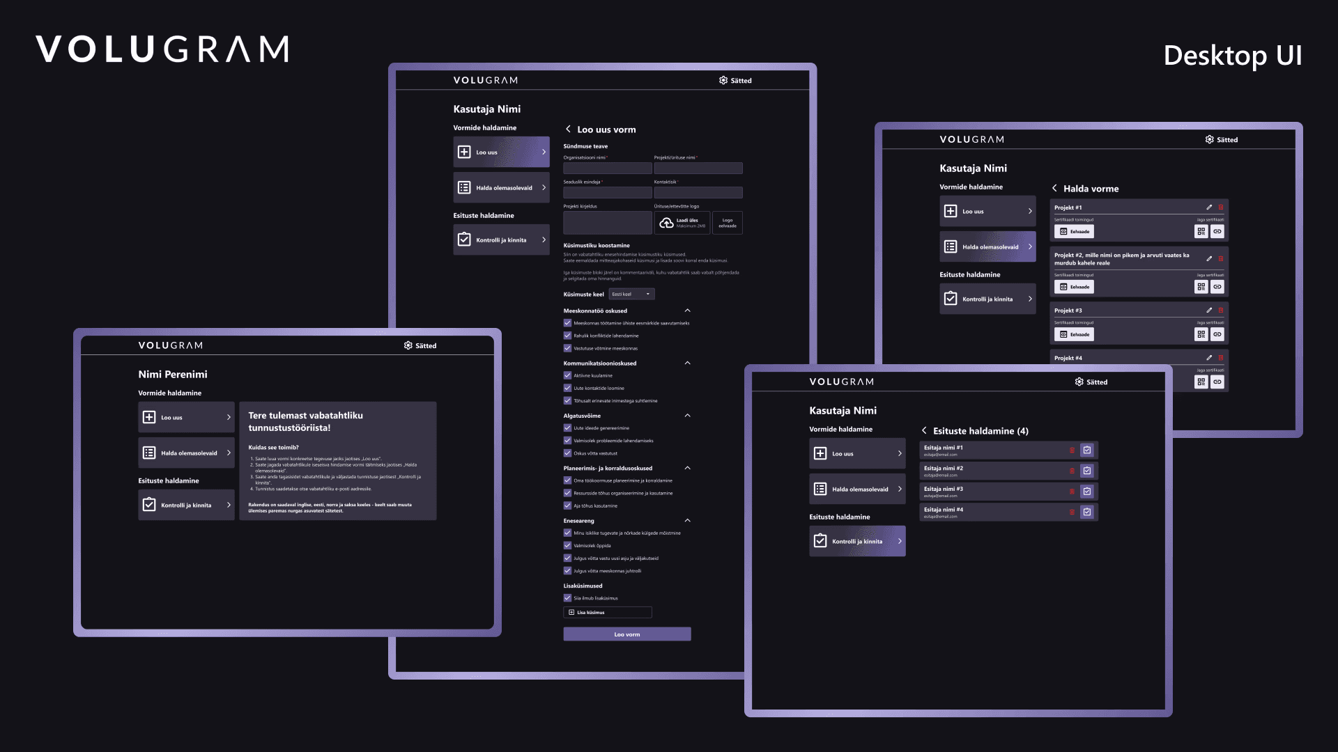
After validating the mobile prototype with the project lead, I designed the desktop version.
With everything in place, I was prepared to conduct testing with a few users and finalize the design for handover. As the new developer familiarized themselves with the current app, I introduced them to my design and remained a consistent source of support throughout the implementation phase.
Website design & deployment
To create a cohesive experience, I redesigned the Volugram project website and deployed it on WordPress. The site serves as a central entry point, offering project information, a short user guide, and access to the recognition tool.
My takeaway
This project strengthened my ability to work within a small, fast-moving team, adapt to changing technical constraints, and take ownership from concept to launch. It also reinforced the importance of clear UX structure when working with form-heavy tools and informal learning systems.