Mar 9, 2026
Branding
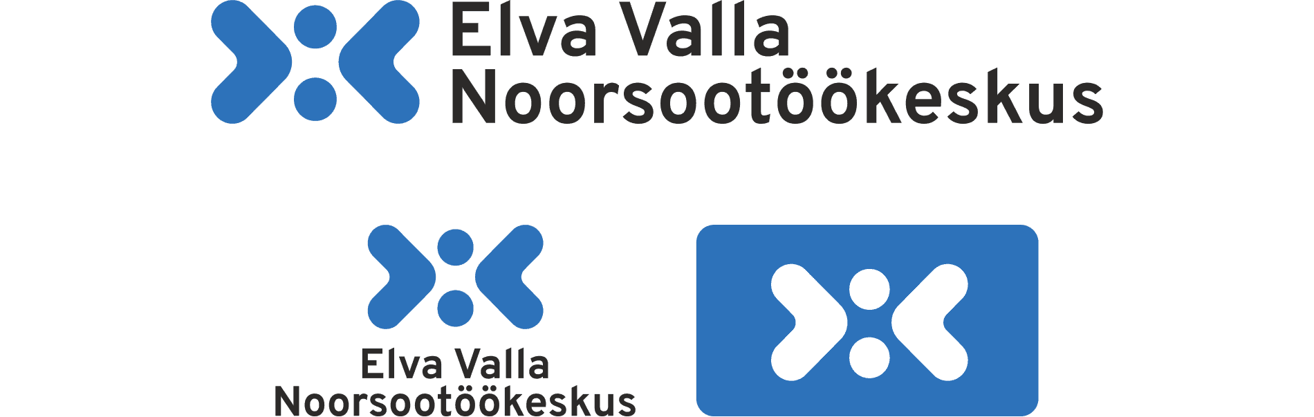
I designed the visual identity for Elva Youth Center, starting from a logo selected as the winning entry in a public competition. The project evolved into a flexible identity system for use across digital, print, and spatial applications, reflecting openness, collaboration, and diversity.
Winning logo selected from over 40 submissions.
Concept
The logo is built around the idea of connection and collaboration. Two forms move towards each other, creating a shared point in between.
This represents young people, youth workers, and the wider community coming together — forming a supportive and unified environment.
The symbol is intentionally simple and open, allowing it to scale across different formats while maintaining a clear and human-centered meaning.
Identity System
The identity was designed as a flexible system rather than a fixed set of elements.
In addition to the logo, the system includes typography, color rules, and modular graphic elements that can be combined in different ways.
Graphic elements are derived from the logo itself, allowing the identity to remain recognizable even when the full logo is not used.
This approach ensures consistency while giving non-designers the freedom to create varied and engaging materials.
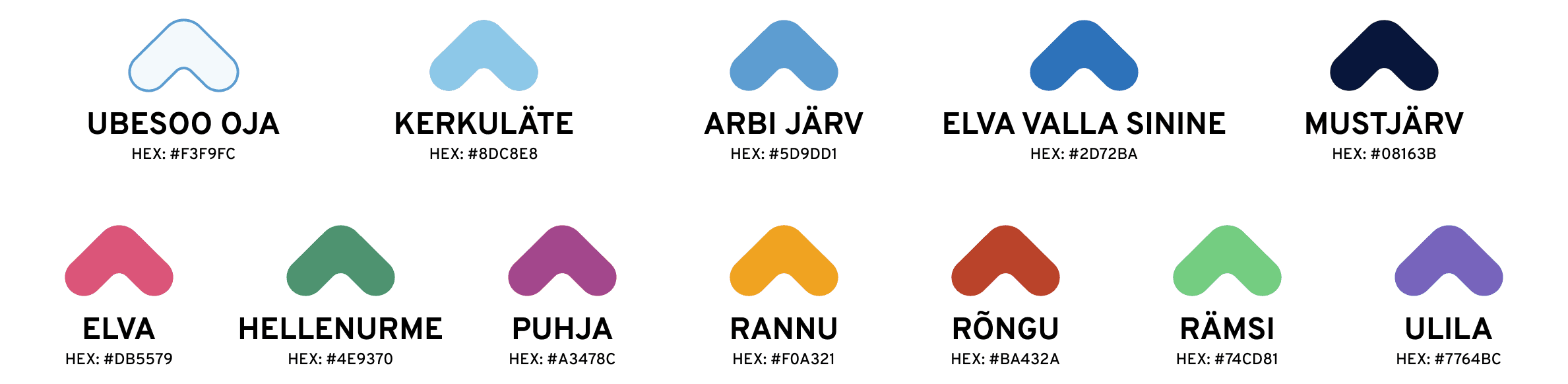
Color System
The color system was designed to balance unity and individuality across multiple youth centers.
A shared blue-based palette creates a consistent and recognizable identity, while additional accent colors allow each local center to maintain its own character.
The primary colors are inspired by local water bodies in different regions of Elva municipality, grounding the identity in its local context.
At the same time, accent colors reflect the history and personality of each center, supporting diversity within a unified system.
Typography
The typography system balances clarity and playfulness.
Overpass is used as the primary typeface for its readability and versatility across digital and print materials.
Shantell Sans is used as a secondary typeface in more playful and youth-oriented contexts, adding warmth and personality to the communication.
Both typefaces were selected for their accessibility and availability, including use in tools like Canva.
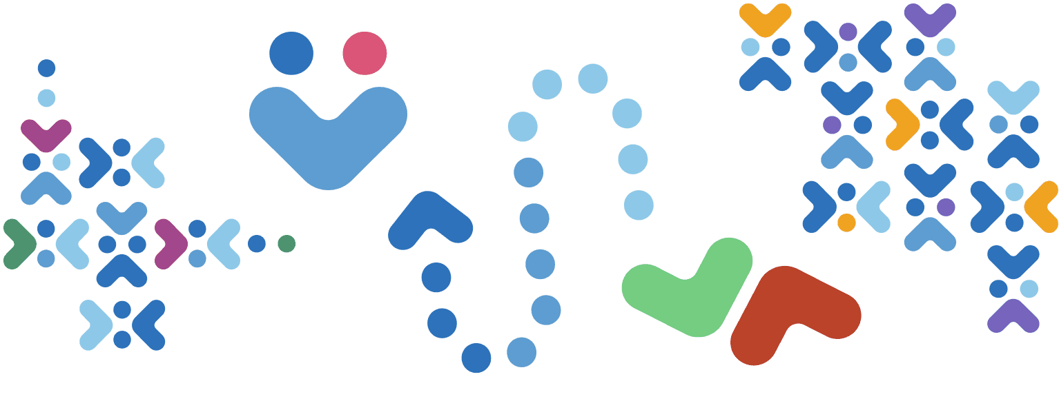
Graphic Elements & Patterns
The visual language extends beyond the logo through a system of graphic elements derived from its shapes.
These elements can be used independently to create layouts, highlight content, or build patterns, while still maintaining a strong connection to the core identity.
Repeating patterns add rhythm and movement, making the identity feel dynamic and adaptable across different formats.
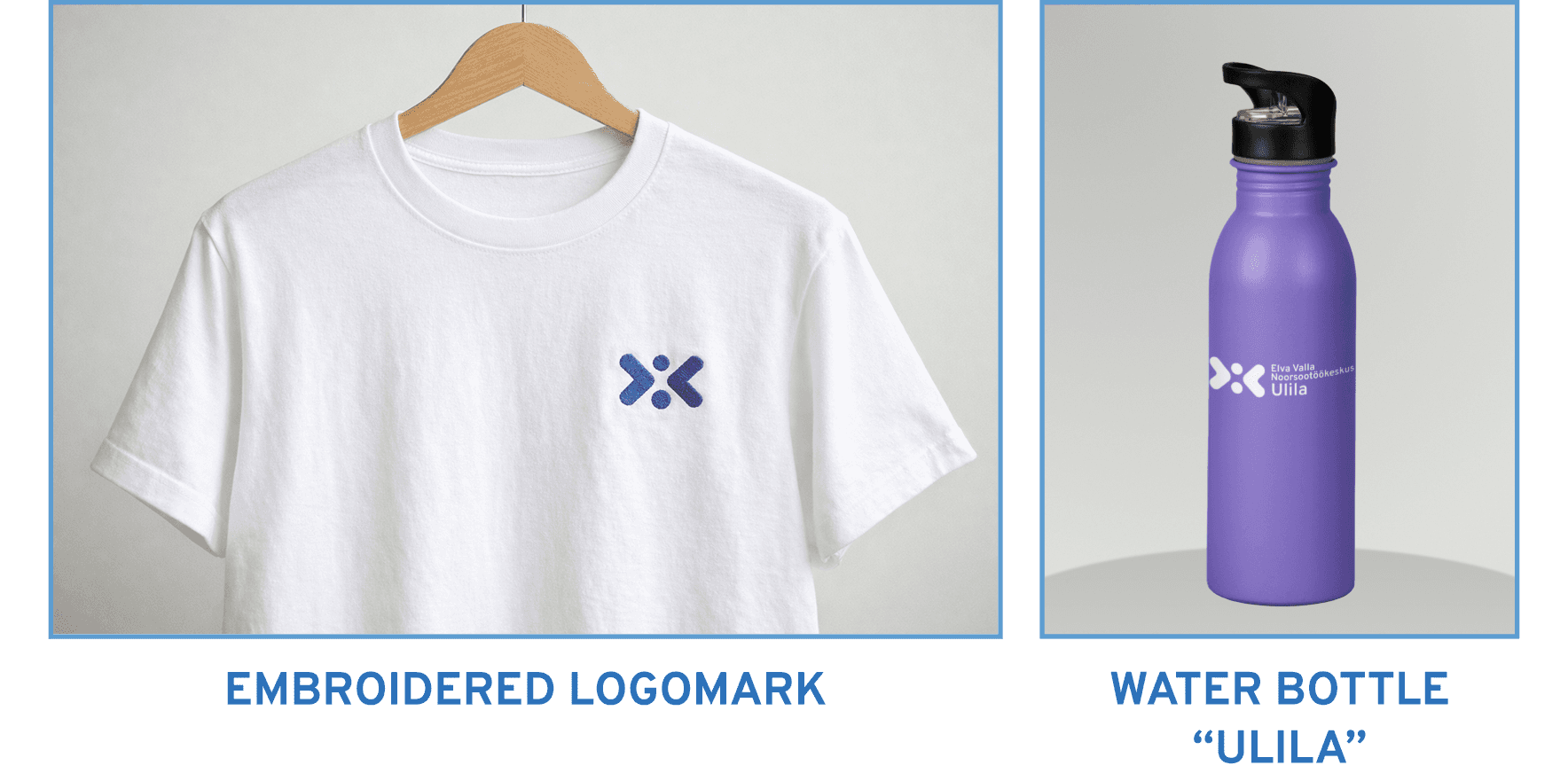
Designed for Real Use
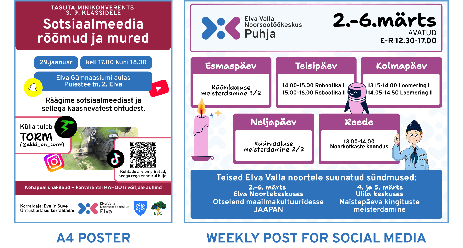
The identity was designed to work in real-life conditions — across social media, posters, schedules, merchandise, and small-scale applications such as embroidery and print.
Since the system is used by multiple youth centers with non-designers, clarity and ease of use were key priorities.
To support adoption, templates and guidelines are being introduced, allowing the identity to be applied consistently while remaining accessible.
Implementation
The identity is currently being gradually introduced across multiple youth centers.
Due to the decentralized structure and varying skill levels, the rollout focuses on simplicity, clarity, and practical tools such as ready-made templates.
This ensures that the identity is not only visually strong, but also realistically usable in everyday communication.
Outcome
The project expanded from just a simple logo design into creating a unified identity for multiple youth centers, each with its own history, audience, and visual background.
The key challenge was to connect these distinct entities into a cohesive system without losing their individuality.
Through this, I developed an identity that is both consistent and adaptable, strengthening my ability to design scalable brand systems for decentralized organizations.