Digital wellbeing tool Tundetester
UX/UI design
The digital tool is a web-based knowledge platform aimed at providing young people with information and support for dealing with complex life situations and emotions. The content is divided into three age groups and further categorized into three main sections. The goal is to offer quick, age-appropriate, and youth-friendly information on common issues and direct them to the child helpline website for more serious problems that they might not be able to handle on their own.
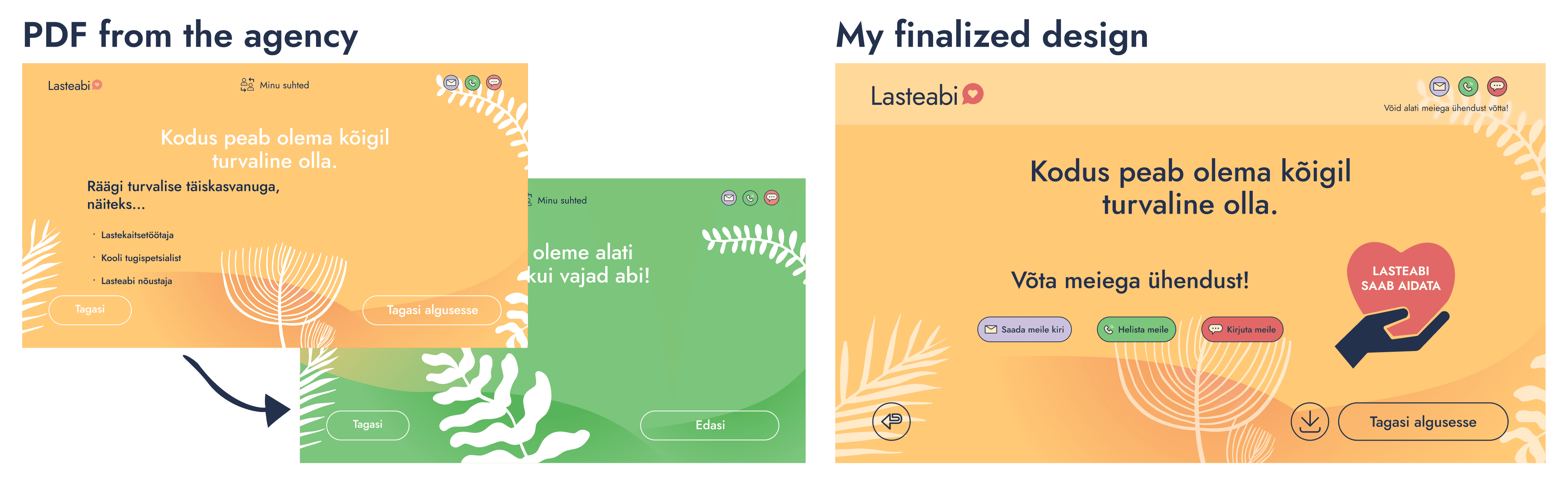
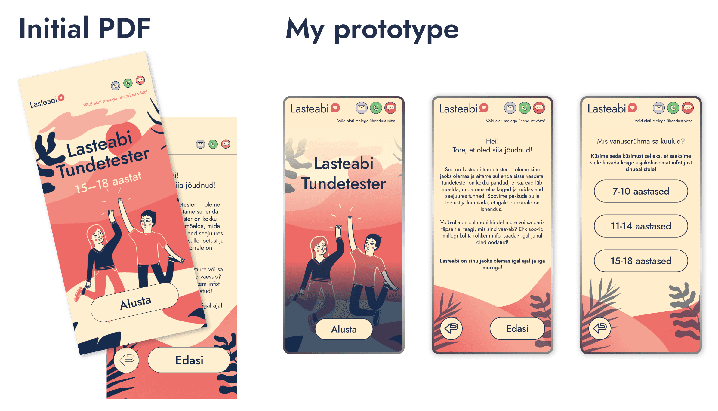
Named the "Tundetester," the tool was initially designed as an interactive PDF by a design agency. However, in 2023, when the child helpline launched its new website, there was a desire to integrate the digital tool into this site. This necessitated additional accessibility, user experience, and interface improvements to finalize the design. The original PDF views had several accessibility and consistency issues that were important from both development and usage perspectives.
Design
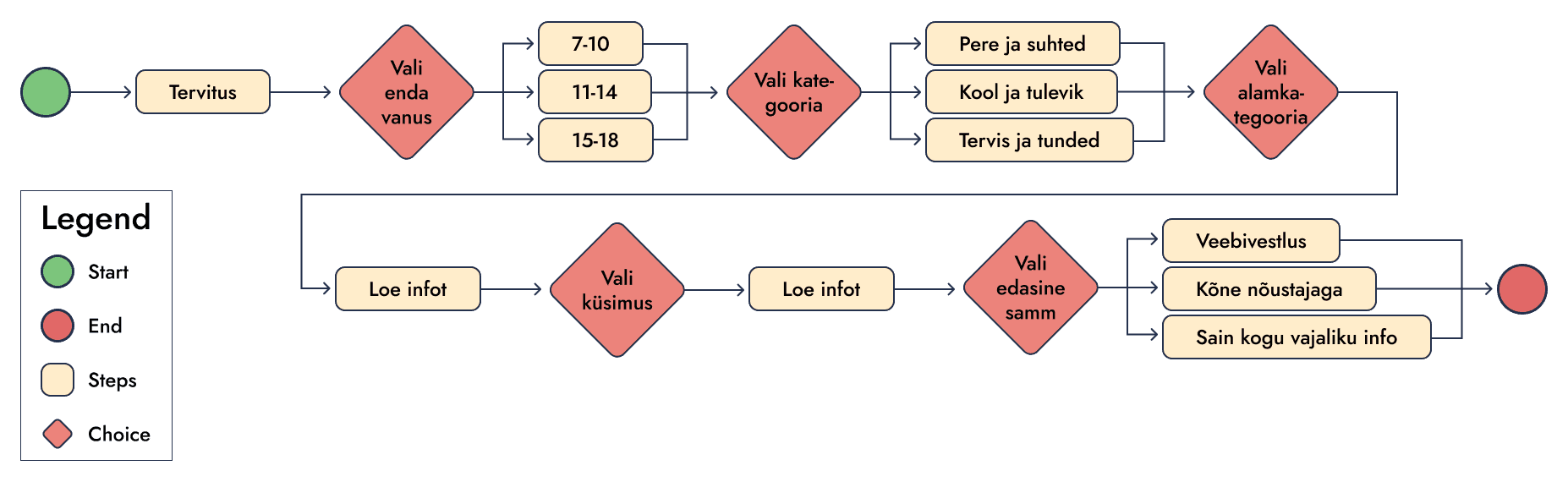
User Journey
The PDF views created by the agency were provided to me as Figma files, which I began organizing. My first step was to map out the user journey a young person would take to obtain the necessary information from the Emotional Tester, putting myself in the user's shoes to create an informative and optimal experience.
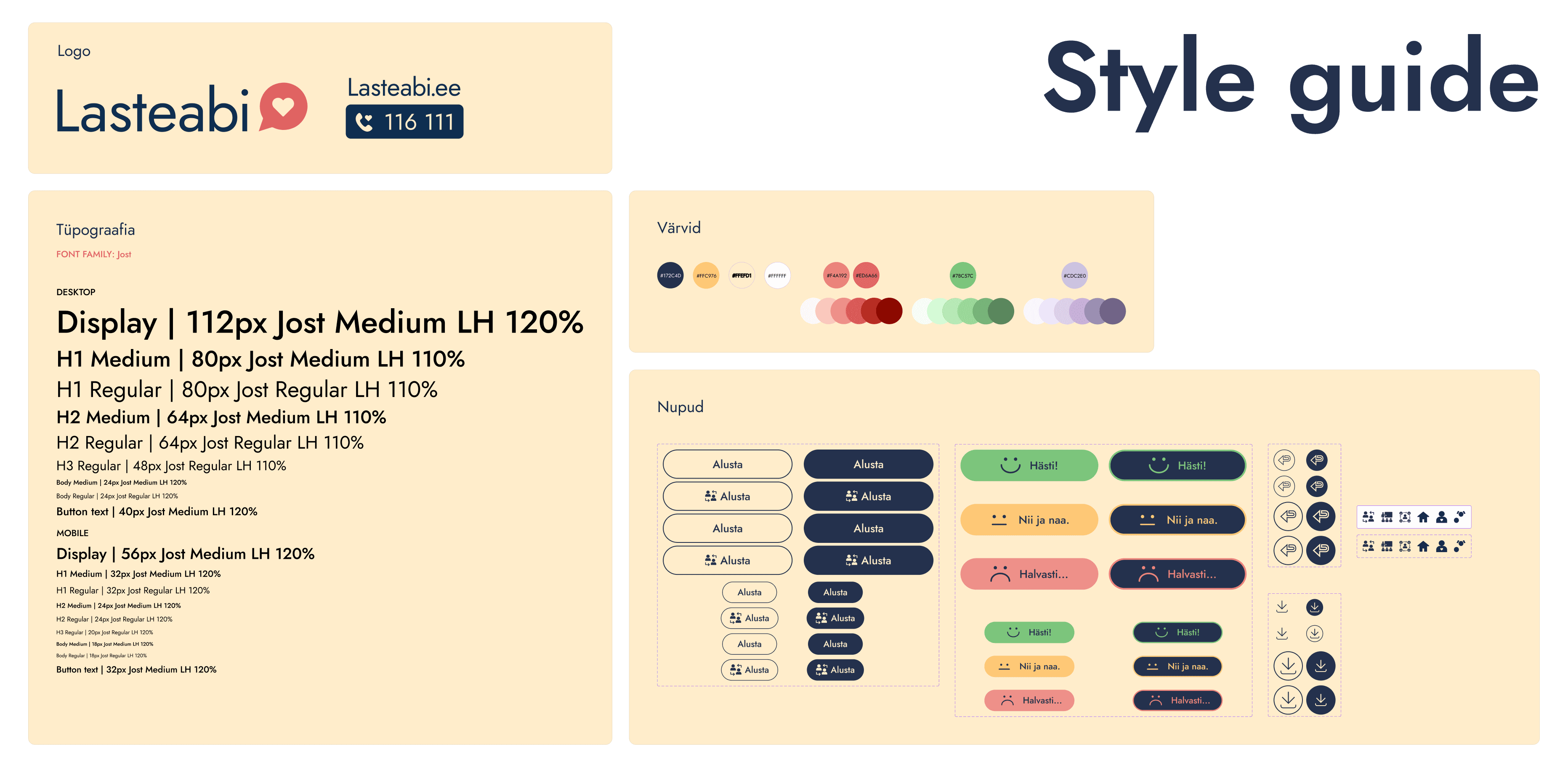
Style Guide
Next, I compiled a list of components needed for different views. I created sample views for various pages, which served as the basis for developing a style guide that included components, typography, and colors. I based the typography and colors on the provided PDF design and the child helpline's CVI. The aim was to achieve a final result that met accessibility standards while adhering to the helpline's style.
From the outset, I had to address the problems identified in the original PDF. I paid special attention to interactive elements, as the original button designs did not meet WCAG requirements and were difficult to distinguish from the background. I completely redesigned these buttons, changing the original white, thin-bordered buttons to variants with a light yellow fill, dark blue border, and text.
Once the initial style guide was created, I began adapting the PDF views for the web. Throughout this process, I continuously refined the style guide.
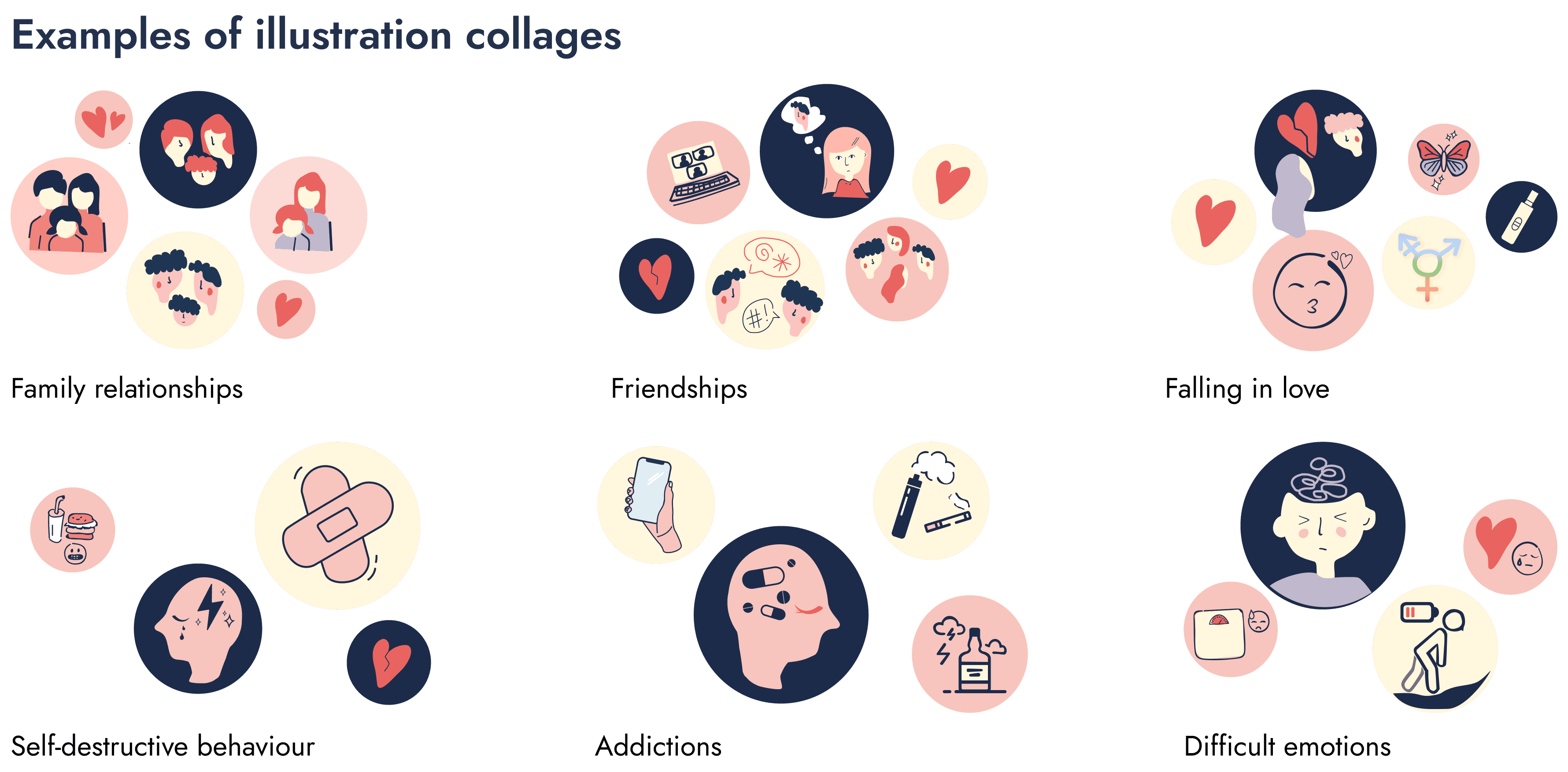
Illustrations
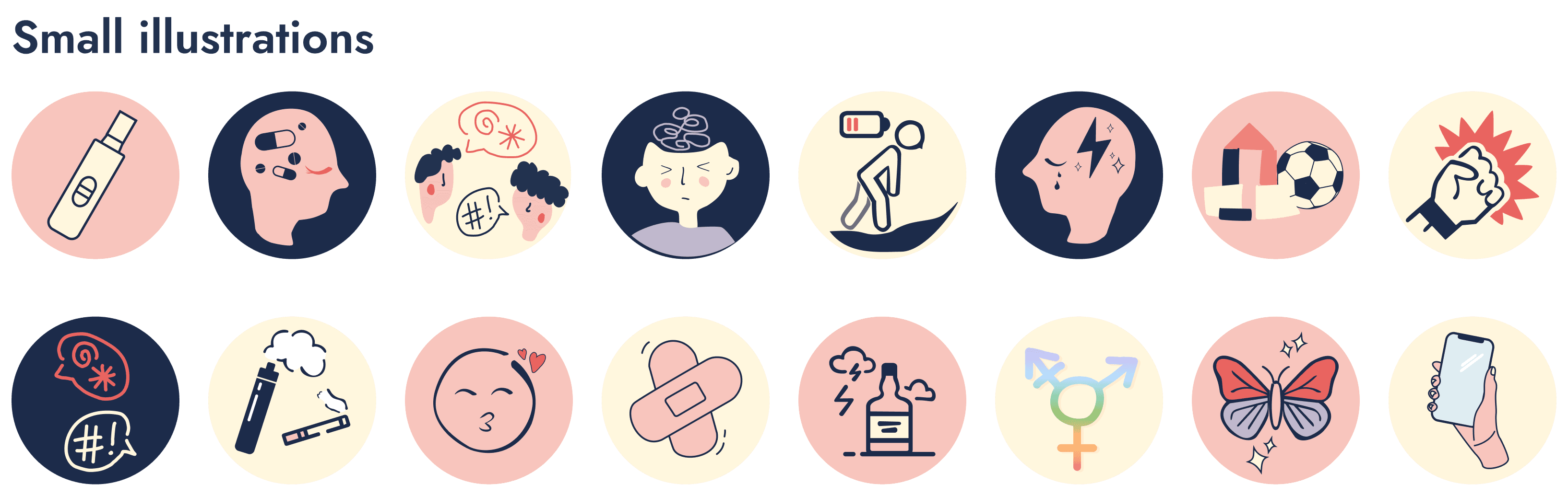
While updating the designs, I noticed the repetitive use of illustrations, despite the different topics covered by the subcategories. I took the time to create unique illustrations for each category to better represent their content, adding diversity and maintaining the attention of the youth audience. I drew inspiration from existing illustrations, which mainly consisted of icon-like thumbnails, ensuring that each subcategory's illustration matched its theme while maintaining a youthful and playful approach.
Prototyping
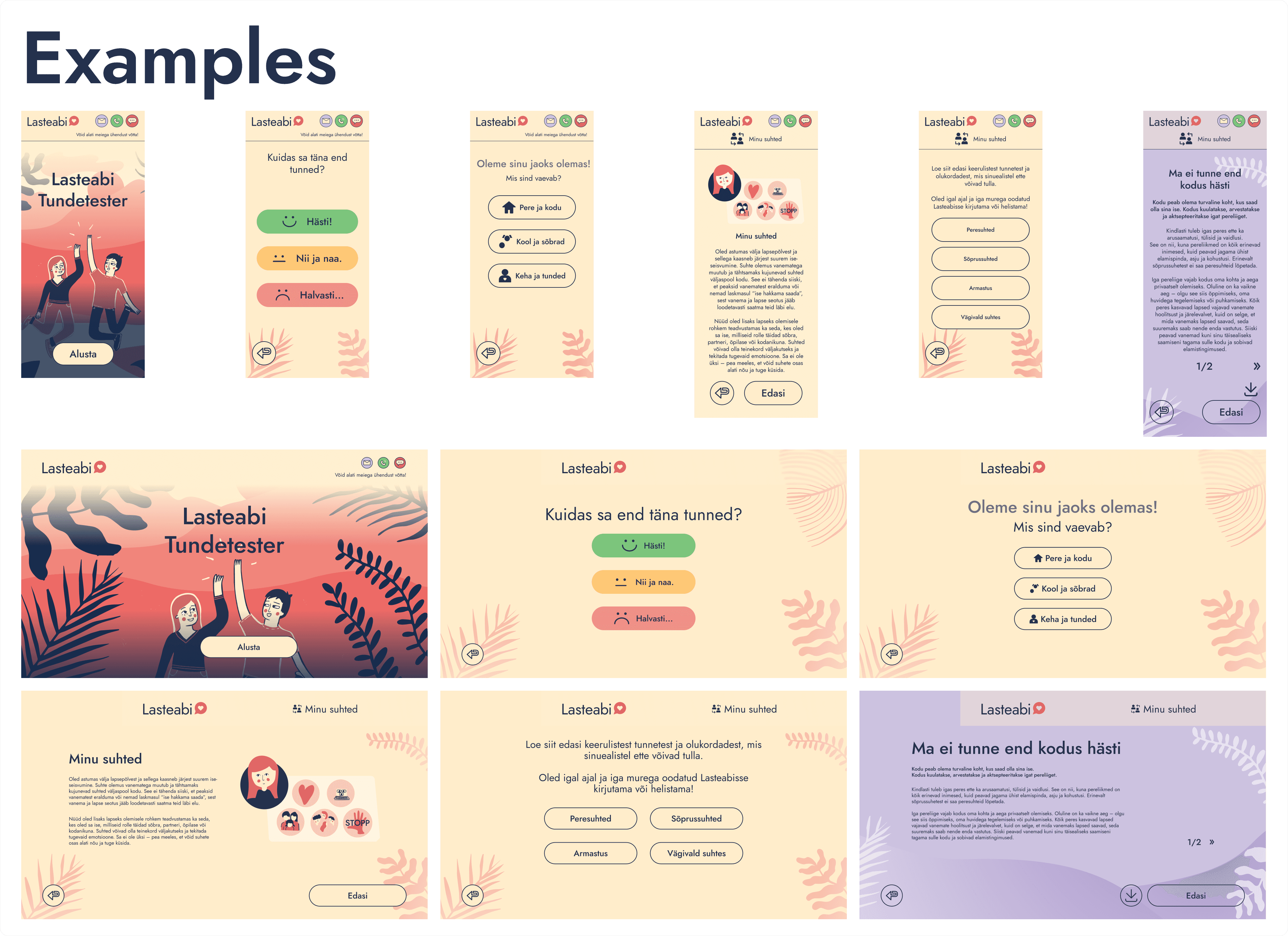
Returning to the digital tool, I first created a prototype for one age group before proceeding with the others. The prototype proved to be well-thought-out, logical, and consistent with the child helpline's style guide, providing a smooth user experience. Given that I transitioned from an interactive PDF, the only noticeable issue was the final view of the digital tool, which directed the user to seek help from various professionals based on their problem. Considering young people's preference for anonymous online help, I decided that all final views should initially direct users to the child helpline website for immediate anonymous assistance via chat or call. My team agreed with this decision.
In the original PDF, the final section had two views: one suggesting further steps and another providing an encouraging message. To make the tool a quick source of information, I combined these into one view, retaining the cheerful yellow background, encouraging message, and further guidance.
After finalizing the prototype for one age group, I proceeded with the others, creating complete prototypes for both desktop and mobile views. Although I didn't conduct large-scale testing, my teammates, including counselors and the service manager, provided feedback. This decision was based on the tool's prior existence and testing in PDF format.
After creating the content section prototypes, I had to consider how the entry into the digital tool would look. Previously, each age group had separate PDF files with the first two slides being the same - a cover image and a greeting. I decided to create unified entry views for the digital tool, adding an age selection option.
The complete prototype was approved by the service manager, and we prepared to communicate with the development team about the next steps.
Additional Activities
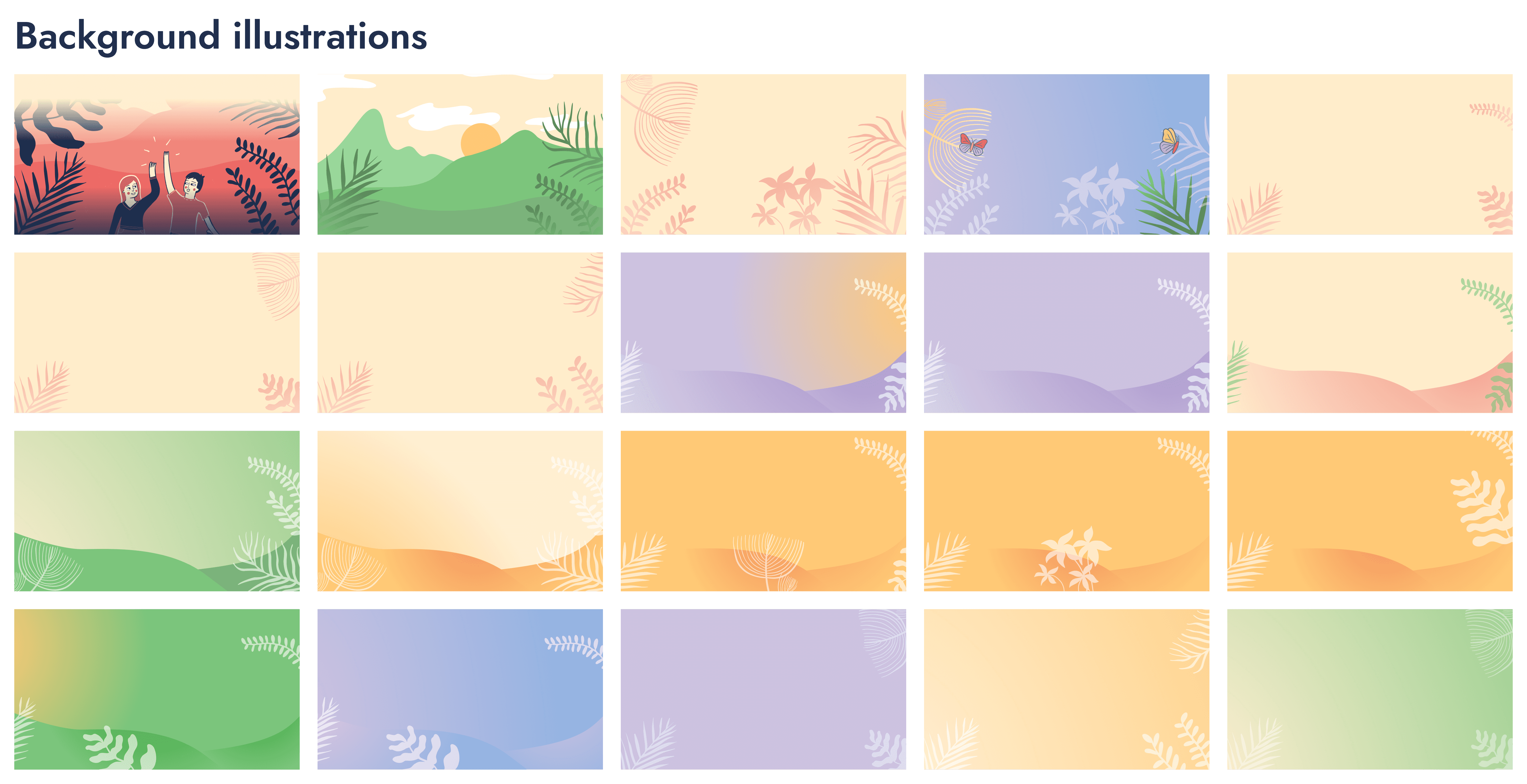
During a meeting, the question arose whether the same design framework could be used for future similar digital tools. The development team confirmed this was possible. We decided to add different style backgrounds to the current tool's design, which could be included in the options on the live site, facilitating the creation of future tools.
After making the necessary changes, I handed over the work file to the development team's project manager. It was later decided to make the final views of the prototype downloadable, allowing young people to save the encouraging message on their personal devices. Therefore, I added a download button component and placed it appropriately in the final views.
During the procurement process by TEHIK, I had the opportunity to contribute my input on the technical description's wording and specifications.
Development
As a UX/UI designer, my role focused on the visual and user experience aspects of Tundetester, working closely with the development teams. The TEHIK team was responsible for integrating Lasteabi's existing codebase with the new code and managing the platform's technical specifications, while Trinidad Wiseman handled front-end and back-end development tasks.
Collaboration took place through weekly meetings and daily communication via Teams and Figma, where development progress was discussed, and necessary adjustments were made. My role remained active throughout the development process, ensuring the design met user expectations, Lasteabi's requirements, and accessibility standards.
Framework
The framework was designed to be as reusable and flexible as possible to ensure easy implementation for future similar tools, as both the Police and Border Guard Board and the Ministry of Social Affairs expressed interest in it.
Since the original content was already in PDF format and visually similar to the web version, extensive user testing was not conducted with the prototype. However, we tested the design across different devices and browsers to ensure accessibility and user-friendliness.
Accessibility
During development, special attention was given to accessibility to ensure that all visual and functional elements met WCAG requirements.
I felt significant support from Trinidad, as they are well-known in Estonia for their strong expertise in accessibility. In collaboration with them, I implemented necessary design adjustments, such as modifying the heading hierarchy and background graphics, to ensure compatibility across various devices and screen sizes.
Testing and Improvements
During testing, we identified the need to reduce the size of buttons and adjust background images, as the text overlapped with background images on small screens, making it difficult to read.
In the final product testing, we discovered that some end views needed additional buttons, such as a download option and a "Tagasi algusesse" button. Additionally, the download button was missing in mobile view. We also needed to add the ESF logo, which had to be included in the opening view of the digital tool. The final changes were made in collaboration with the development team, who also created the technical documentation for the developed code and the initial user manual.
After building one user journey for the Tundetester framework, we conducted tests with a small group of young users and gathered feedback. The young users appreciated the friendly and playful environment, and they liked the illustrations. However, older users expressed a desire for more complex topics and content presented in a more adult-like manner. This feedback was helpful, and we have planned to organize the content into different age groups.
Self-reflection
Collaboration with developers taught me how important the small details of design are and how developers pay close attention to them. I also learned that it's crucial to design for all screen sizes, even when the design is initially created for desktop view, as usability issues may arise on smaller screens.
Working with developers made me look at my work more critically and forced me to focus and analyze design details. Additionally, it was incredibly enjoyable to work with a team that is so patient and understanding. The collaboration ran smoothly, and all parties were very cooperative, supporting each other's work well.
I also learned that it's important to stand up for your target audience, and when your position is justified and you're able to explain your decisions, people will trust and listen to you. However, this requires serious preparation and analysis to be aware of your target group's needs and behavior patterns.
I am very happy to have been involved in this project from start to finish through two stages of my internship, and I was also entrusted with the final decision-making for the Lasteabi side of the project during the development phase.