Analysis and improvements of the Lasteabi website
UX/UI design
UX/UI Analysis on the Lasteabi website
At the beginning of my internship, I conducted a comprehensive UX/UI analysis of the Lasteabi website to identify the main issues and challenges to address during my time there. I continued to analyze the site throughout the internship to discover new problems and areas needing attention. To ensure thorough results, I used various devices, including computers, phones, multiple plugins, SiteImprove, and different screen readers.
The results of the UX/UI analysis served as a guide throughout my internship, directing my focus and decision-making. My primary goal was to ensure accessibility, consistency, and clarity for all users on the Lasteabi website.
The analysis highlighted the need to improve accessibility, such as defining headings with appropriate HTML tags and enhancing navigation structure. Attention was needed for keyboard navigation and ensuring all buttons and functions were usable. Additionally, the design of user interface elements did not meet the contrast or interactive element requirements set by WCAG. Although the Lasteabi website has a separate panel for visually impaired users, the regular website should still meet at least AA accessibility standards.
Mobile view revealed several issues, including complex menu navigation and important information for screen readers that was missing or insufficient. Furthermore, images and text optimization for mobile view could have been better.
Addressing these issues and general content unification were crucial to ensuring the website's user-friendliness and accessibility for different users.
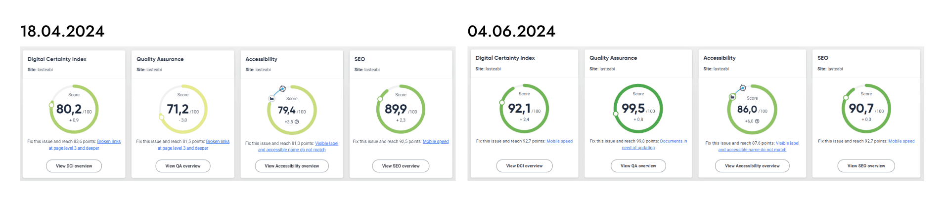
At the end of my internship, I conducted a similar UX/UI analysis to evaluate the changes made during the internship and set new goals for further improvements to the website.
Improvements of the Lasteabi website
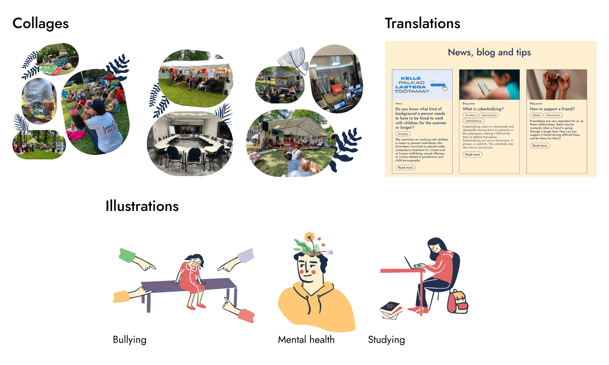
Guided by the initial UX/UI analysis, I began by unifying the content on subpages, addressing varied styles due to different contributors. This process allowed me to familiarize myself with the Drupal platform, standardize text formatting, fix broken links, and replace photos with illustrations for consistency.
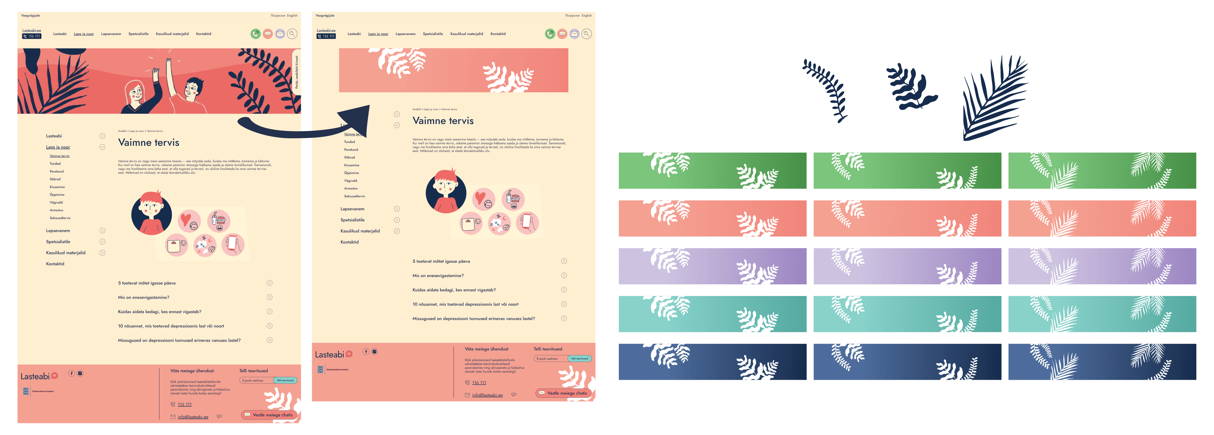
I then added new header banners using the Lasteabi style guide to enhance the site's appearance and user experience. Feeling more comfortable with Drupal, I utilized SiteImprove to identify issues such as incorrect heading levels and broken links, which I corrected to improve accessibility and functionality.
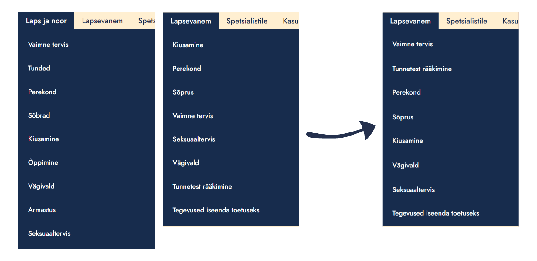
Further, I resolved navigation inconsistencies between the "Child and Youth" and "Parent" categories by rearranging subpages for a unified structure. I also fixed content filters that previously led to "no results" pages by categorizing materials correctly.
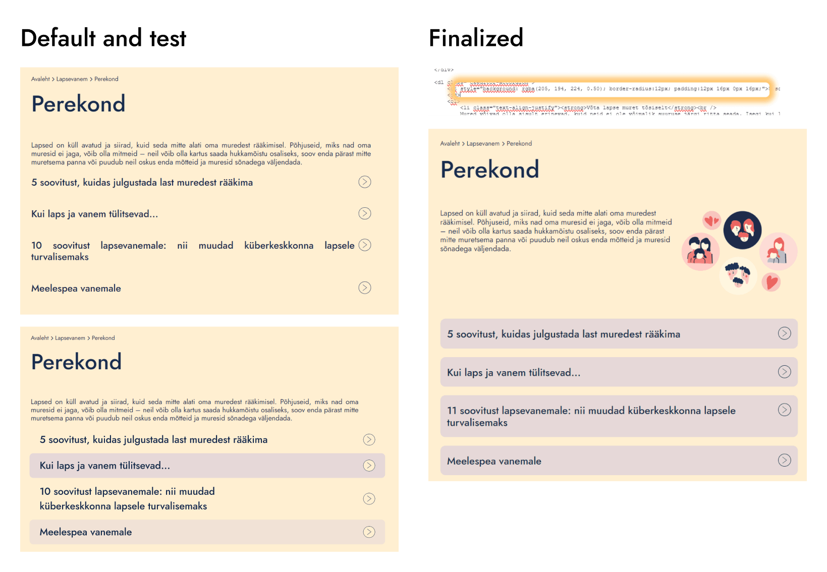
To improve clarity, I adjusted the accordion system's design, making them visually distinct and interactive by changing their background color to purple.
Throughout the internship, I continuously addressed smaller issues identified by SiteImprove and monitored improvements using SiteImprove metrics. Additionally, I managed content, translated news posts, and added visual elements to subpages.